weekly Michael23's 2012 52 COMPLETED! WooHoo! Slide show added

Joy, I think I'd like to see number one in colour, cute baby toys lose something in B&W!

Completely agree with this... baby things, to me, should be either so over-saturated they're in danger of being a Sands brochure, or gentle and pastel and soft and fluffy.

Number two is a lovely shot of your daughter, but her adoreableness steals focus from the bump, which is enhanced by the DOF. Personally I think it would be a better shot if the focus was shared between them with something (perhaps her hand placed on the bump with her head rested on it?) between to centre on.

Congratulations on your impending joy :)


:plusone:
 
Joy - Agree with a colour no:1 - but I prefer no:2 anyway - that's a great Picture, with Joy being the theme I think the pure focus on your daughters face is great for the theme :thumbs:

:plusone:

#2 really says joy to me, its a lovely shot and makes for a nice pregancy picture. Nice and soft and lovely. Has the awwwww factor in buckets.
 
I like the bump one. :thumbs:

I suppose 'Joy' will mostly be 'happy people' shots. Maybe there'll be some cars, houses etc as in Pride and Joy I'm gonna wait a couple of days I think ... see what others come up with :suspect:

Hi Bob, thanks for taking a look, pleased you like the bump shot, will be interesting to see other interpretations.

Hi Michael, sorry I'm a few weeks behind!

Symmetry, I like the two train shots, I guess it's always difficult getting a shot straight on unless you're allowed to stand on a ladder on the tracks:bonk:

I like the detail in three but four wins it for being perfectly symmetrical, I like the moody grainy feel to it.

Moody, I see what you were getting at in number one. I agree that a crop off the bottom would bring the cottage out and add to the mood.

Obviously I'm a Fluffy fan so like the window with him in it, but without is just as good. As for pp you can see quite a large area repeated but the nails do highlight it! I always use the clone stamp tool but make sure I take a new sample each time when I'm cloning along straight edges.

Joy, I think I'd like to see number one in colour, cute baby toys lose something in B&W! Baby Gap eh?

Love number two, your daughter is very photogenic, I remember her in your magical shot. That's some bump already, you sure there's only one in there ;)
It looks like there's part of a zip just above her left eye that draws my attention.

Hi Marsha, thanks for having a look though the previous weeks pictures. See below for the colour version of the blanket shot. As for bump, certainly seems bigger at this point than it did the 1st time round, 2? I only ordered 1 :lol: Caitlin was 9lb13 so goodness knows what this one will be! The blanket was so cute, we couldn't resist, plus it is about the only neutral thing we can find! Its all just boys or just girls these days.

Completely agree with this... baby things, to me, should be either so over-saturated they're in danger of being a Sands brochure, or gentle and pastel and soft and fluffy.

Number two is a lovely shot of your daughter, but her adoreableness steals focus from the bump, which is enhanced by the DOF. Personally I think it would be a better shot if the focus was shared between them with something (perhaps her hand placed on the bump with her head rested on it?) between to centre on.

Congratulations on your impending joy :)

Hi Vicky, colour version below. Thanks for your thoughts on the bump shot, noted for future reference. I was limited in light as it was 19:20 and natural light I had 1/60 at f1.8. Thanks for the congratulations too :D


Thanks!

Joy - Agree with a colour no:1 - but I prefer no:2 anyway - that's a great Picture, with Joy being the theme I think the pure focus on your daughters face is great for the theme :thumbs:

Thanks Dean, again, please see below for the colour version. As for the focus, I think it has worked well, concentrating on my daughters smile. It could have very easily been missed at f1.8!

:plusone:

#2 really says joy to me, its a lovely shot and makes for a nice pregancy picture. Nice and soft and lovely. Has the awwwww factor in buckets.

Thanks very much Alex! Pleased you like it!

Now for the colour version of the blanket, I did the original in b+w as I couldn't get the blanket colour right, but more or less got it sorted via altering the white balance in camera raw.


blanket 2 by scilly puffin, on Flickr
 
Oh I much prefer the colour version :clap:

michael23 said:
As for bump, certainly seems bigger at this point than it did the 1st time round, 2? I only ordered 1 :lol: Caitlin was 9lb13 so goodness knows what this one will be!
I had similar and got them to have a darn good check that there was only one in there! When I mentioned how big I felt to the dr she said very matter of fact 'it's just wind':gag:
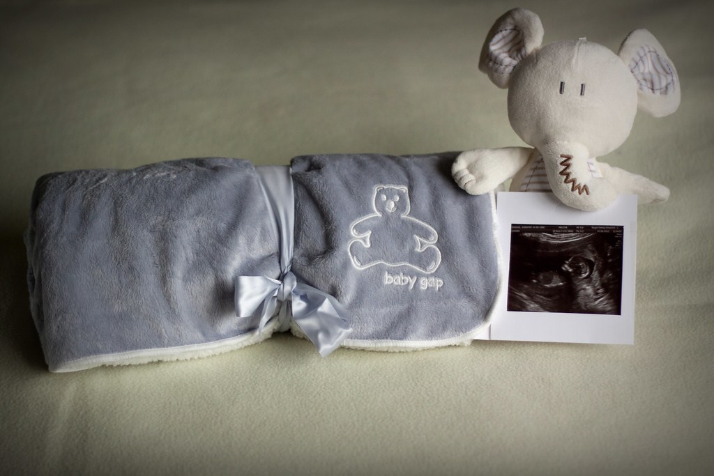
I think I looked 20 weeks gone from 10 weeks:bonk:

michael23 said:
The blanket was so cute, we couldn't resist, plus it is about the only neutral thing we can find! Its all just boys or just girls these days.
Not that I want to encourage your spending but Mamas and Papas do VERY nice neutral stuff, more importantly they have a sale on right now ;)
 
no.1 looks better in colour but I think the arrangement could be better, maybe with the blanket behind the teddy? dunno really lol

however the 'bump' shot is brilliant! Joy at a lovely special family :) :) well done mister M :clap:
 
You need a Lotty my kids love the mirror tummy!

Thanks for the link Marsha, very cute!

no.1 looks better in colour but I think the arrangement could be better, maybe with the blanket behind the teddy? dunno really lol

however the 'bump' shot is brilliant! Joy at a lovely special family :) :) well done mister M :clap:

Hi Summer, a different arrangment could well have worked, I might have tried this if the blanket I was using for a background waas bigger. I am very pleased with the bump shot. Thanks for popping by :thumbs:
 
Hi, Michael, Joy indeed. It's #2 for me...also with a hint of pride. RH side of her face looks at tad hot on my laptop :thinking:

Cheers.
 
Hi, Michael, Joy indeed. It's #2 for me...also with a hint of pride. RH side of her face looks at tad hot on my laptop :thinking:

Cheers.

Thanks Andy, the side you mention is a blown, thanks for commenting :thumbs:

#2 is a fabulous portrait. It tells a story as well as being a nice capture of your daughter.

Thanks very much Peter, pleased you like it :thumbs:
 
Congratulations Michael....

I prefer the colour of the blanket, lovely... although I did have to read the text a couple of times, as first time I misread it and was gonna ask how you'd managed to do the ultrasound with your nifty fifty :D...

However, the bump shot, is excellent, and is my fave of the two.
 
GOing to start this weeks theme with this one, needed to do something whilst being on my own and waiting for a plumber to fix a dodgy cistern!

These are incybincies, I assume thats how its spelled :lol: which are quite small and can be used as pencil toppers. Pretty cool little creatures actually! Anyway....


Week 27, Small by scilly puffin, on Flickr

I did want them sitting under an enormous mushroom, but I didn't have one to hand :D
 
They are cute little blighters. Quite a few toys have been used during this year's posts.

Pencils would be good to give them some perspective...as they are they could be quite big...

Cheers.
 
Had to go look up what the theme was... They do look small, and whilst I like the first one, look like they're plotting and scheming... I prefer the second one for the theme... lovely texture in the log, and it provides context and scale for the little creatures
 
I like the 2nd one best as you can see them to scale better :)
 
Thanks very much John and Summer. I quite like number 2 as well. There are so many options I could have tried with these, but ran out of time and loads of stuff that needs doing. I think I shall have another play with these when things are less hectic. :thumbs:
 
Hi Michael, I like both of these for small though I feel #2 suits the theme better with the scale!:)

I do hope Fluffy isn't feeling too left out!!:lol:
 
Hi Michael

Small #2 - made me smile. Good detail in the log and illustrates the theme well.

Thanks Alan :thumbs:

Hi Michael, I like both of these for small though I feel #2 suits the theme better with the scale!:)

I do hope Fluffy isn't feeling too left out!!:lol:

:D Fluffy is fine, he sent these out on an assignment and is pleased with the results :thumbs: NUmber 2 really works well for the scale. I tried to use more but these were the only 2 which would stay put.
 
:lol: love the little characters on the log, great little blue fella :D
 
Trying to catch up on a few.
Symmetry - after all the photos I think the crop is simple and gets the message across, nice choice.
Moody - the cottage is the one and B/W well processed. As metioned the right type of model at the window would work well.
Joy - both shots work well and on theme. #2 with the smile is favourite
Small - the log shot conveys small, well thought out and executed
 
:lol: love the little characters on the log, great little blue fella :D

Cheers Gramps, there are some interesting characters in these, one of my faves is the blue one as well, apparently there are over 100 to collect, we appear to have around 50 of them!

Trying to catch up on a few.
Symmetry - after all the photos I think the crop is simple and gets the message across, nice choice.
Moody - the cottage is the one and B/W well processed. As metioned the right type of model at the window would work well.
Joy - both shots work well and on theme. #2 with the smile is favourite
Small - the log shot conveys small, well thought out and executed

Hi John, thanks for popping by and catching up :thumbs: Thanks very much for the comments, much appreciated :thumbs:
 
Hi Michael
I like the idea but would like to have seen the face a bit brighter to emphasise the eyes looking straight at camera. Agree it fits this weather as well.
 
Hi Michael, I prefer small number two with the two little dudes on the tree, much better for a sense of scale.

Straight, I like the idea for the theme but agree that your daughters face is a little dark. Nice composition though and DEFINITELY fits our beautiful summer!
 
Back
Top