THE PP GAME!

Congratulations Graham.
The challenge you have set is a type of image that most of us have had a go at over the years. That wind swept lone tree, the tree on the island in the river/lake. The snow-laden tree with its branches touching the ground. I’ve taken them but never really scored with one, one in particular comes to mind every time I see an image like the subject. I had taken a shot of a tree outside of the French town of Orange, the winds were so bad that the tree had had a harness attached to help hold it firm.
It turned out to be a half-decent image, so I printed it for a club competition, I spent hours in the darkroom spotting and such to hide the cable only for the judge to say “I know that tree, it’s at Orange, it would be better if the ropes were shown.” and marked me down. What did he know!

My edit.
I thought the picture is all about the trees and not so much the sky, I saw it with less sky and the trees playing a stronger roll but I didn’t want to loose the regression to the skyline or the foreground. The width was needed for the trees to have space. I thought a crop would loose all that.
I further thought how like a watercolour it was that lovely pale blue, and pastel shades of green.
So,
Open in ACR, no edits, open in PS.
Copy layer.
Make a selection starting at the left hand side, going along the darker grass line sweeping above the trees and back down to the grass line and off to the right-hand side then back across to the left side keeping in front of the darker grass mound.
Feather by 60 pixels, edit-copy-paste, this puts the selection into a new layer. Name this layer trees.
SAVE.
Transform using transform scale, increasing the size of the trees selection, OK.
Using the move tool, move the selection down until the upper grass line lines up with the layer underneath.
On the copy layer, clone the trees out above the skyline, using sky samples.
On the trees layer create a mask, hide any mismatches, and reveal the copy layer background, I needed to do a bit of creative cloning to make the townscape match.
SAVE.
On the copy layer, make a selection of the sky utilizing the rectangular marquee tool. Pull it out across the full width and down to bellow the dense cloud that points down, feather by 60 pixels, edit-copy-past.
Name the new layer sky.
Using the move tool, move the selection down, covering the dominant cloud on the left.
Select transform, distort, and pull the edges so that the cloud takes on symmetry with the direction of the trees. OK.
On the sky layer, create a mask and blend the edges of the selection in.
When everything looks OK, flatten the image.
SAVE.
Now crop but only to lose the unwanted sky above what had been the sky layer.
Applied auto levels.
Increase the saturation on the green and blue.
Got rid of the barbed wire.
Dodge and burn a bit.
Applied a warm filter at 25%.
Select all create border using stroke.
SAVE
Save for web.

Criticism welcome.

TP-TREES-WEB.jpg


Rhodese.
 
Last edited:
Hey all,

Hope it’s ok if I join in – very new on the forums so just finding my way around. Obviously haven’t read every single page of this thread, but read the first few and last few so think I get the rules. If I do anything stupid, just tell me!


9544879391_3a93be76ce_o.jpg


My edits:

Open in LR, Levels to get the tree photo similar to the hill one. Export to CS5.

Select trees and surrounding areas, layer via copy.

Move that layer to the hill image, free transform to fit, levels and colour balance to match surrounding area.

Ctrl+alt+a+e to merge, clone to blend images as well as clone out the shadow for right tree as it was the wrong way for the combination.

Over all levels layer for contrast.

Black & white conversion – boost yellow, decrease blues.

Ctrl+alt+a+e then burn shadow for tree, clone distracting shadow on grass (dark spot that turned darker on B&W conversion) and one tiny spot of a distracting cloud on the right side.

Levels layer masked for ground.

Levels layer masked for sky.

Brightness/contrast layer masked painted in highlights and low lights.


About 30 mins I think (got distracted by the world’s longest phone call in the middle so not sure exactly ;)) and all I have time for today even though it's not perfect.
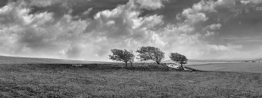

Miko
 
A newcomer to the game!

I'm not a great lover of heavy PP but thought I'd have a quick play, so here's my 5 minutes' worth! Just flipped it horizontally and dropped the middle tree back in backwards, then tidied up the transition with the clone tool. No tone mapping etc, just a quick alteration. Took Mrs Nod as long to spot what was now "wrong" as it did for me to do it...

 
Dup post sorry :bonk:
 
Last edited:
A newcomer to the game!

I'm not a great lover of heavy PP but thought I'd have a quick play

Nod on this thread :clap: :clap: :clap:

I thought there would be more chance of Mrs Nod having a go :lol:
 
Great stuff well done to all, and welcome to our 2 first timers. :wave:

all great edits - hard to fault in their own way.... purley a personal decision as to the places....

3rd... Miko, love the processing, just not sure having the 2 focal features in works. but welcome in. look forward to seeing more.

2nd, Rhodese, made the simple sky work really well, understand the reason for the space around the trees, but think they might be too central for me.

1ST - SymmetricalOCD - Ben done it again.... faultless blend of the dramatic sky with the trees, colours in sky and grass complimenting each other perfectly. I originally shot this with a view to a B&W conversion, but your colour edit has certainly made me see it differently.

I went to town on this one a bit, 3 exposures of each image, belnded the sky with the trees in each, (having flipped the trees and enlarged them), before editing them to bring out the sky.
Cloned out the small tree growing beside one of the main ones too. ALso tidied away a few stray branches.
Dodge and burn the clouds too.


Well done, and thankyou to everyone. :thumbs:
 
Ben a very well done :clap:

Can I copy your next edit & submit as my entry with a minor tweak :nuts:
 
Thanks for the welcome and the comments on my image, Graham!... And conrgats to you Ben!

Miko
 
Nut_Holder-1.jpg


Edit in LR5:
Straighten and crop
Boost exposure and contrast
Lower highlights, boost shadows and whites. Blacks lowered.
Clarity +80, vibrance +51.
Split toning with hues 33 and 231. More warmth to the slabs.
Aqua and blue hues boosted slightly (to contrast the slabs).
Spot of sharpening and vignette.
Done!
 
1186191_10153190294485305_171423762_n.jpg


In ACR:

Boosted contast
decreased saturation in the blue channel and increased luminance
used adjustment brush on the seeds to increase clarity
cropped
added post crop vignette

In PS:

-Made new layer of the purple stone - used colour balance to change to the same colour as the other slabs.
-made a new layer of the "cross section" and added two to the bottom, thought it gave a bit more symmetry and framing :)

Time: 15mins.
Feedback OK.
 
was sorely tempted to start from one of those two and just clone out the coil of string... :lol:

edited in SNS-HDR with 3 exposures saved as TIFF's with WB warmed up a bit
contrast up a bit
not so much on microdetails and microcontrast as it overdid the detail on the slabs
tweak to brightness

into PS
didn;t think the placement sat well with the handle on the join in the slabs
so.......
duplicated layer, moved it down and left
on (copy of) original layer, cloned slabs and joins over where the feeder was
masked over edges of moved layer to blend
cloned out coil of string
first by selecting part of the curve below it and rotating, resizing, distorting to suit.
then manual cloning, different size brushes, opacities and sample areas to suit.
high pass filter, 4 px, soft light 50% opacity, only really affected the mesh part.
straightened and added vignette

20 - 30 mins or so

 
Ruddy heck Ben you do pick some shots :lol:

In & out of PE10 & LR4 many times to try & get something I felt was OK. In the end no scientific method other than absolute total confusion. I tend to work like a nutter shoving the slider back & forth - then forth & back - so sorry I really can't remember what I did other than manic stuff :gag:

A few minutes at each of many times over the last few days but today sat for around 30 minutes.

Feel free to critique :thumbs:

 
o.k here we go...

3rd place goes to Daydreamer I like the warmth of the colours here but it's perhaps slightly overly saturated and a bit too tight with the crop.
2nd place goes to Overbez, can't fault the cloning but it's slightly too neutral for me
and the winner is ....

Andrewp colours are spot on not too neutral and not too warm, nice crop and yours is pretty much exactly how I would process it.

I haven't had time to process my own edit of my own photo but I'll pass it onto Andrewp, been extra busy lately sorry for the late repsonse. Thanks to all who entered and I'll pass this over to Andrew, well done!
 
Good un Andrew get the champagne out & we'll celebrate :clap:

Oh I don't drink so a cappuccino will do :lol:
 
Cheers Ben. It was an interesting choice of photo!

Onto my photo. Taken yesterday on a walk in the Brecon Beacons with my brother and both our dogs. In the shot he is on top of Fan y Big (a few jokes made from that) and on a rock that projects out known as the 'diving board'. To the right you can make out the silhouette of his black labrador.

20130825-_MG_0052.jpg


RAW download link:
https://dl.dropboxusercontent.com/u/1029480/TP/20130825-_MG_0052.CR2

I'll call this one Thursday evening. Good luck!
 
Hi all first time here and only learning but I did try.
Problem is I am so sorry i opened it in Lightroom played with a few sliders and then opened in Photoshop and lost track of what i did.:(
I enjoyed trying!
Cathy


Trial by cooriedoon, on Flickr
 
Hi all first time here and only learning but I did try.
Problem is I am so sorry i opened it in Lightroom played with a few sliders and then opened in Photoshop and lost track of what i did.:(
I enjoyed trying!
Cathy

Good to see you on here Kathy & you're off to a really good start :thumbs: As I said in the other threads it is indeed a fine thread to hone you PP skills :clap:

where's my pint you promised? :gag::nuts:

Pint of cappuccino :thinking: That's going some even for me :gag:
 
............ i opened it in Lightroom played with a few sliders and then opened in Photoshop and lost track of what i did.:(............

Hi Cathy - you'll fit in fine around here with a workflow like that!!! :lol:
 
adjusted in LR
ps with topaz filter
cropped

ppg.jpg


feedback or not is cool
 
Last edited:

valley by btyreman, on Flickr

all done in PSE 10,

ACR sharpened and added a bit of clarity with colour noise reduction, and removed all chromatic aberration.

duplicated background layer and added high pass filter,
blended set to soft light at around 60% opacity,
created a black fill layer and painted in texture, very subtle effect that you can only see around the edges, basically it looks dirtier.
added a cooling filter set to 4% opacity,
saved as jpeg.

critique is welcome.

Ben.
 
Last edited:
o8mn.jpg


Increased contrast,
midtone contrast, microdetails adjusted
lights saturation increased
overall sat reduced to compensate

in PS
magenta filter added to sky
slight dodge of highlights in sky
straighten
crop
black borders top and bottom.

15 mins - no problems with any feedback, or none... :thumbs:

struggled a bit with this - think I wanted to find more in the sky than there was. And I resisted cloning your brother and dog out, somehow... :nuts:
 
Thanks for those at took part - always interesting see the different results and try and learn something.

I'm going to hand this one to Cathy.

Nice warm colours in both the landscape and the sky with a crop that gives a cinematic feel. I also like the contrast between the foreground and the valley beyond and the overall crispness.

Well done! :clap:


For those that wanted some feedback (I'm no expert!)

Sponner - Has a slight hdr feel which loses some of its punch. Like the saturation boost to the sky - something I've done to other shots that day.

Ben - Looks nearly as it was on the day but lacking a touch of colour for me -perhaps go full B/W? Great sharpening skills though and in getting the silhouette clean. The textures add some interest to the clouds - nice idea.

Graham - Like the contrast but find the sky too magenta for my liking.

For my edit I'd done a few variations in LR5 - the first one being a mix between Sponner's and Ben's. But my favourite was a B/W conversion.

20130825-_MG_0052-2.jpg


The only other decent shot I got that day is here http://www.flickr.com/photos/76905062@N02/9592369407/. I adjusted the sky in a similar way to Sponner.

Over to Cathy!
 
Last edited:
What an excellent start & a well deserved winner :thumbs:
 
WHAT! Really!

Well I am so pleased and I would like to thank you for being so kind :) well done everyone.

Oh Gosh now what out of my thousands of pics needing a tweak will I post?
Ok I will go and look.
Huh! I feel quite happy now :)
 
Well it was either this or a jetty at Loch Ard.
Have fun and please remember it is not great to start with but do your best!
Turnberry Lighthouse on another visit trying to capture something at Sunset .


funtime by cooriedoon, on Flickr
 
Last edited:
Great photo Andrew, i would have loved to try editing it :)
And welldone Cathy, that was a tough one :thumbs:

BTW is there a raw version or should we edit the jpeg??
 
Well it was either this or a jetty at Loch Ard.
Have fun and please remember it is not great to start with but do your best!
Turnberry Lighthouse on another visit trying to capture something at Sunset .


funtime by cooriedoon, on Flickr

well done, the photo looks fine as it is so ill enter that lol
 
Oops I thought it was a raw out for dinner and a few wines
but if you can wait I will post raw in morning
Cathy
 
edited from the CR2/RAW file.


lhouse2-2-1 by btyreman, on Flickr

PSE 10:

Duplicated background layer,
added high pass filter at 30% then duplicated,
boosted shadows,
colour corrected,
unsharpen mask,
noise reduction,
added letterboxing by increasing the canvas size.

imported PSD file into LR5:

used a gradient filter on the sky,
filter on the grass with a clarity and saturation boost,
radial filter on the wooden hut with increased exposure and clarity,
Tone Curve: increased highlights +25.

saved to jpeg with sharpening.
 
Last edited:
Back
Top