THE PP GAME!

CNV00009.jpg

Lovely!:thumbs:_____________________________________________________________________________^^NO FISHING!!
 
Last edited:
How about closing time of 9pm Wednesday for this one?

Joan
 
Wednesday sounds about right Joan.


CNV00009b-sepia by tonky8203, on Flickr

Adjusted levels.
Cloned out bouys.
Added sepia tone.
Added borders.
 
9zSBE.jpg


• Cropped the image.
• Cloned out the reeds on right hand side.
• Selected the sky then used paste into to paste another sky.
• Used dodge & burn to increase contrast in places
• Imported into Topaz B&W and did a custom conversion to B&W
• Imported into Topaz Detail and used the Edge Softener pre-set to soften the image a little.
• Select all/edit stroke to add black edge to image.​
 
Heres my attempt...


CNV00009 by Adrian Deans, on Flickr


First opened with ACR. Adjusted the hue values to make everything look autumnal. Reduced clarity, maybe a boost of vibrance, touch of contrast added.
Opened in CS5, used content-aware scale to make a more panoramic vista. Added some clouds using a mask i made from the blue channel of the original layer. Duplicated this layer and flipped to make slight reflection on the water. Used blending options slider so that the underlying highlights show through on the water. Some burning to add some definition around the mountains and their reflection. Made a border using canvas size, and outer glow.

Joan - Im in love with the look of this picture. By that i mean the characteristics of the film used. Its just gorgeous, dont really know how to explain it, other than its like a painting. Dynamic range maybe?:shrug:
 
Last edited:
Adey: I think that is a combination of everything being right at the time, lighting was ideal, weather was great, location beautiful and of course...taken on film, if I recall correctly it was a Fuji 400, a film that I have always found pretty good.

Joan
 
Loads of Fuji 400 available on 120 film Adey. Its pretty common for film to be offered in various film formats.
 
It was probably Fuji Pro 400H 120, I mainly used Superia 400 for 35mm though and Reala sometimes.

Any more entries lurking?
 
I had two edits for this pic, done a few years ago, here's the first

Mwyngil_Sepia_20x16.jpg


Here's the second.

Mwyngil_Colour_20x16.jpg


I actually prefer the sepia version

And the winner is...................Mr G:clap: 
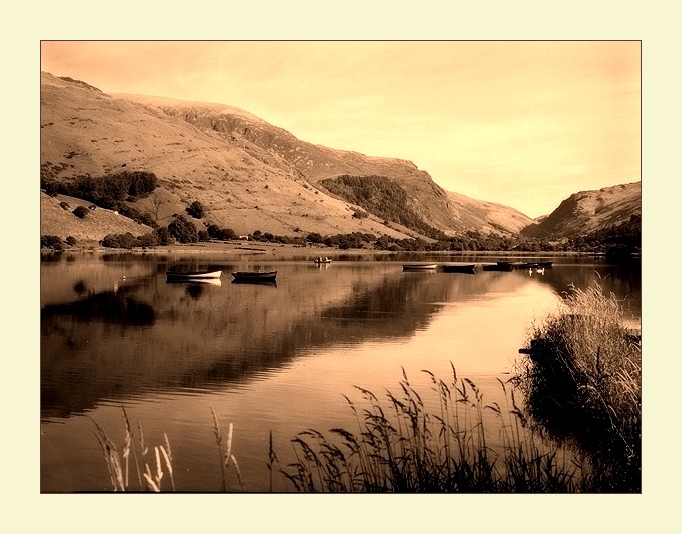
because he took the fishermen out and added the no fishing sign.

A close second is Wallyboy:thumbs:, I'm not normally a great lover of paint effects but this one suited the image
 
Last edited:
So....over to you Mr G, let's shake this thread up a bit, only five entries for this one, no good saying "no inspiration from the image supplied" give it a go, I treat each pic as if it has been brought in by a customer and they have asked me to do the best that I can.


Joan
 
I think i'll participate in these shenanigans. Looks like a great way to learn others techniques.
 
Welcome, look forward to your participations in our shenanigans :)

Joan
 
Nice job Thedodo. Mine looked similar to yours for ages before i decided to start again.

Mine was the same. Cropped, forced the perspective and brought out some colur with the On image select tools in Hue and Curves. I did clone out the posts and road but decided to keep them in at the last minute to just tweak a picture rather than change it.
 
Sheeesh - I can't remember half of what I did this time. I played around with levels for a while then decided to go for this dusk look. Added each of the lights to a different image and then combined the images using layers.

Added borders.


castle edit. with street lights by tonky8203, on Flickr
 
Last edited:
Thanks for the vote, it's 4am and just checking my emails before heading to the airport so can I ask for someone to put up something in my absence, of to London wont be back till Sunday night and will have no access to a computer.
cheers guy's :)
 
Thought I'd have a go too.

093_1.jpg


Edits (done in Aperture):
  • Straightened/cropped
  • Cloned out unwanted items
  • Added curves, levels and colour adjustments
  • Sharpened (quite extreme)
  • Enhanced definition/vibrancy
 
Well done Briony - nice crop! :thumbs:
 
Cropped, sharpened and boosted saturation.
Added frame on a layer.
Cut out ear and paw for pop out effect.
Added drop shadows under ear and paw.


cat-edit by tonky8203, on Flickr
 
thought i'd have a play at this.


briony by leftcurl, on Flickr

i was distracted by the bright area on the far right of the shot, so decided to go for a heavy crop.

Desaturate slightly, then upped saturation in the yellow to bring out the eyes and nose area a little. High pass filter on the eyes to pop them. Rotated to the left a little to line the shot up with a line on the rug. Levels adjustment. Added vignette. Added 0.5cm to the canvas in black. Job done :thumbs:

(but the above was not necessarily in that order :thinking:)
 
If its ok, I've had a play?

tppp.jpg


I used a technique from a magazine tutorial, basically splitting the pic into individual frames, and playing with random ones, from blurring, to altering alignment to enlarging, all good fun, and easy to do, just makes for something a bit different. Hope its ok?:)
 
Last edited:
of course you can play wilmorh...
that's the thing with tutorials... once you know how, it's easy and you can implement it into other edits. :thumbs:
 
You could move those bits about and make a jigsaw. :D Well - a puzzle anyway.
 
Back
Top