

You are using an out of date browser. It may not display this or other websites correctly.
You should upgrade or use an alternative browser.
You should upgrade or use an alternative browser.
Show us yer film shots then!
- Thread starter Grant
- Start date
FruitFlakes
Suspended / Banned
- Messages
- 1,735
- Name
- Lloyd
- Edit My Images
- Yes
Yep, I was at 1/500th and f/11 at some points during the shoot, I know Portra can handle the overexposure but I wasn't sure how well my V500 handles dense negs. The sides will probably be cropped for print plus I haven't done much masking for the final image. Definitely need to get a BIII adapter + some NDs for it!
EDIT: As an aside, this was Portra 400 converted to B/W in post, I usually don't go for the blurry look but there's something about this shot I like

EDIT: As an aside, this was Portra 400 converted to B/W in post, I usually don't go for the blurry look but there's something about this shot I like
Last edited:
Steve
Suspended / Banned
- Messages
- 1,685
- Name
- .... Steve
- Edit My Images
- Yes
Yep, I was at 1/500th and f/11 at some points during the shoot, I know Portra can handle the overexposure but I wasn't sure how well my V500 handles dense negs. The sides will probably be cropped for print plus I haven't done much masking for the final image. Definitely need to get a BIII adapter + some NDs for it!
EDIT: As an aside, this was Portra 400 converted to B/W in post, I usually don't go for the blurry look but there's something about this shot I like
wow...love it.
That could be a Bridgette Bardot shoot from the 60s.... beautiful
Taken on Lubitel 166.

This one is particularly nice.
Cezar
Suspended / Banned
- Messages
- 221
- Name
- Cezar
- Edit My Images
- Yes
This one is particularly nice.
Thank you
") I should have proper scans of the negs next week, stay tuned
I should have proper scans of the negs next week, stay tuned freecom2
Suspended / Banned
- Messages
- 5,326
- Edit My Images
- No
Hasselblad 500C/M, Provia 400X
I see the appeal of slide film but the difficulty in getting accurate exposures in the rolls of slide that I have shot so far put me off it (Velvia aside, I feel like digital has more latitude for certain things). And Portra works superbly for portraiture anyway.

I see the appeal of slide film but the difficulty in getting accurate exposures in the rolls of slide that I have shot so far put me off it (Velvia aside, I feel like digital has more latitude for certain things). And Portra works superbly for portraiture anyway.

35millimetre
Suspended / Banned
- Messages
- 1,401
- Name
- Charlotte
- Edit My Images
- Yes
Nice, I really like the Sprocket Rocket shot!
skysh4rk
Suspended / Banned
- Messages
- 3,134
- Name
- RJ
- Edit My Images
- No
Hasselblad 500C/M, Provia 400X
I see the appeal of slide film but the difficulty in getting accurate exposures in the rolls of slide that I have shot so far put me off it (Velvia aside, I feel like digital has more latitude for certain things). And Portra works superbly for portraiture anyway.
This is certainly better than the portraits I was getting out of Provia. Although some of my difficulties could be exposure-related, the biggest problem for me with Provia 400X, or any slide film for that matter, is the scanning.
I don't seem to have any problems with Portra or Ektar, so I've sold most of the slide film that I was in my fridge and have decided to primarily shoot the two Kodak films as I have much better success scanning them.
freecom2
Suspended / Banned
- Messages
- 5,326
- Edit My Images
- No
Nice, I really like the Sprocket Rocket shot!
Thanks! The shots are a bit hit and miss and I do wish they were a bit sharper, but it's just about the cheapest way you can get into 35mm panoramic photography.
This is certainly better than the portraits I was getting out of Provia. Although some of my difficulties could be exposure-related, the biggest problem for me with Provia 400X, or any slide film for that matter, is the scanning.
I don't seem to have any problems with Portra or Ektar, so I've sold most of the slide film that I was in my fridge and have decided to primarily shoot the two Kodak films as I have much better success scanning them.
I checked the highlights and there was a surprising amount of detail in the shadows, although nothing in comparison to what I could get out of negative film. But another shot on the roll had the highlights blown (bad light meter technique) so slide is a bit of a difficult beast to tame!
- Messages
- 9,277
- Edit My Images
- No
trevorbray
Suspended / Banned
- Messages
- 9,141
- Name
- Trevor
- Edit My Images
- No
Great. The horses and rusting hull are superb.
MindofMel
Suspended / Banned
- Messages
- 1,586
- Name
- Mel
- Edit My Images
- Yes

Threeracers
Suspended / Banned
- Messages
- 573
- Name
- Mark
- Edit My Images
- No
That is very nice.
Mark
Mark
skysh4rk
Suspended / Banned
- Messages
- 3,134
- Name
- RJ
- Edit My Images
- No
I checked the highlights and there was a surprising amount of detail in the shadows, although nothing in comparison to what I could get out of negative film. But another shot on the roll had the highlights blown (bad light meter technique) so slide is a bit of a difficult beast to tame!
I've been having trouble with slide film as well, which I thought was due to poor metering. When I look at my slides, however, the highlights look good and there appears to be plenty of detail in the shadows; I just simply couldn't see any of these details in any of my scans.
After a bit of reading, I think that slide film is really pushing the capabilities of my scanner (the dmax is only 3.2 or so). It just seems to lose everything in the shadows no matter what I do, even if the detail is there in the original slide.
Oh well, that's what I get picking up an older Epson 4490 for £4. Having to stick to negative film is a small price to pay for paying a small price...
I can't stop looking at this.
freecom2
Suspended / Banned
- Messages
- 5,326
- Edit My Images
- No
After a bit of reading, I think that slide film is really pushing the capabilities of my scanner (the dmax is only 3.2 or so). It just seems to lose everything in the shadows no matter what I do, even if the detail is there in the original slide.
Oh well, that's what I get picking up an older Epson 4490 for £4. Having to stick to negative film is a small price to pay for paying a small price...
For reference, that was scanned on an Epson 4180.
Threeracers
Suspended / Banned
- Messages
- 573
- Name
- Mark
- Edit My Images
- No
What a difference a day makes;
Tuesday

Wednesday

Mark
Tuesday
Wednesday
Mark
medwaygreen
Suspended / Banned
- Messages
- 4,425
- Name
- Richard
- Edit My Images
- No
^^^^^^
That,s Nice for you.
#2 is a much better compostion, but I do like both shots, what camera and film etc.
That,s Nice for you.
#2 is a much better compostion, but I do like both shots, what camera and film etc.
Last edited:
FruitFlakes
Suspended / Banned
- Messages
- 1,735
- Name
- Lloyd
- Edit My Images
- Yes
The blur just makes it look soft, which gives it a very warm feeling - I think I like the second shot more than the first personally!
It does look like a 60's fashion shot! Really lovely and flattering look.
Love it!
I love that second one Fruitflakes. Very classy, lovely conversion.
love this.
That is very nice.
Mark
Thanks for the kind words guys! Goes to show that sometimes the best work is done when you're up against the limit and fighting for light.I can't stop looking at this.
wow...love it.
That could be a Bridgette Bardot shoot from the 60s.... beautiful
Yup, that was my immediate impression when I saw her in that dress (well apart from 'oh wow!', shame I didn't bring my Leica/other Rollei for her to pose with!
Threeracers
Suspended / Banned
- Messages
- 573
- Name
- Mark
- Edit My Images
- No
^^^^^^
That,s Nice for you.
#2 is a much better compostion, but I do like both shots, what camera and film etc.
Thanks Richard. Camera is a Minolta Dynax 9. The wet and windy Tuesday is FujiPro 400H and the sublime Wednesday is Portra400. I prefer the Wednesday composition too but didn't want to walk that far on Tuesday!
regards
Mark
skysh4rk
Suspended / Banned
- Messages
- 3,134
- Name
- RJ
- Edit My Images
- No
For reference, that was scanned on an Epson 4180.
I have been using the same workflow for my slides as I have for my negatives (linear scan in Vuescan with no adjustments and then using the film profiles in the colorperfect plugin in PS to correct colour). Although I really like how my negatives come out, perhaps I need to look into approaching my slide film scanning in a different way, as I what I'm doing currently is definitely not working.
- Messages
- 4,158
- Name
- Rob
- Edit My Images
- Yes
One of my darkroom prints from this morning. Ilford Multigrade 9x11,1/4" paper set to grade 3.5. 35mm Fomapan 100 negative.


- Messages
- 4,158
- Name
- Rob
- Edit My Images
- Yes
Cheers Des
Whats the worst that can happen, the enlarger is no good, bin it and have some more space in the shed. Otherwise get it out and get some printing done
Whats the worst that can happen, the enlarger is no good, bin it and have some more space in the shed. Otherwise get it out and get some printing done
compulsivehordr
Suspended / Banned
- Messages
- 320
- Name
- Alastair
- Edit My Images
- No
One of my darkroom prints from this morning. Ilford Multigrade 9x11,1/4" paper set to grade 3.5. 35mm Fomapan 100 negative.
Love it - it sums up so much about what we do (or used to do) for our love of photography.
- Messages
- 4,158
- Name
- Rob
- Edit My Images
- Yes
Love it - it sums up so much about what we do (or used to do) for our love of photography.
Cheers Alastair, yes indeed, the funny things we do...

desf
Suspended / Banned
- Messages
- 2,235
- Name
- Des
- Edit My Images
- Yes
Cheers Des
Whats the worst that can happen, the enlarger is no good, bin it and have some more space in the shed. Otherwise get it out and get some printing done
You're quite right of course.
In my defence, I'm mostly doing medium format stuff and the enlarger is a 35mm only Durst.
Still I should try it again, if only to show my kids some stone age technology.
Andysnap
Suspended / Banned
- Messages
- 16,322
- Name
- Andy Grant
- Edit My Images
- Yes
Just one more from the Greenwich meet but from the following day.
Mamiya C330f, Mamiya Sekor 80mm on Kodak Ektar and converted in Topaz b&w
DLR3-b&w by andysnapper1, on Flickr
Cheers
Andy
Mamiya C330f, Mamiya Sekor 80mm on Kodak Ektar and converted in Topaz b&w
DLR3-b&w by andysnapper1, on Flickr
Cheers
Andy
- Messages
- 11,730
- Name
- Chris
- Edit My Images
- Yes
I have been using the same workflow for my slides as I have for my negatives (linear scan in Vuescan with no adjustments and then using the film profiles in the colorperfect plugin in PS to correct colour). Although I really like how my negatives come out, perhaps I need to look into approaching my slide film scanning in a different way, as I what I'm doing currently is definitely not working.
Why do colour correction separately for transparencies? I can see the point wiht negatives, because of the varying colour bases. But transparencies are all expected to be projected with the same colour. So why not just do them in Vuescan?
skysh4rk
Suspended / Banned
- Messages
- 3,134
- Name
- RJ
- Edit My Images
- No
Why do colour correction separately for transparencies? I can see the point wiht negatives, because of the varying colour bases. But transparencies are all expected to be projected with the same colour. So why not just do them in Vuescan?
Yeah, I don't know. This process worked so well for negatives that I just kept on doing the same thing for slides without thinking, but it would seem that this probably isn't the way forward.
I'll fiddle around with Vuescan over the next week or so to see what I can get out of it.
Gaz81
Suspended / Banned
- Messages
- 1,676
- Name
- Gary
- Edit My Images
- Yes
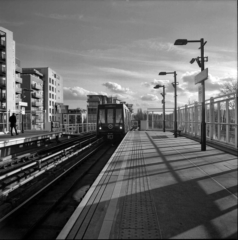
Taken an a Zeiss Nettar (6x6) with Neopan 400 at Preston Bus Station.
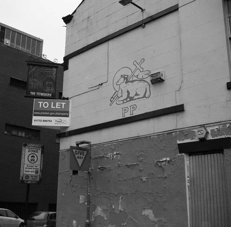
img003 by Gary Sutton, on Flickr
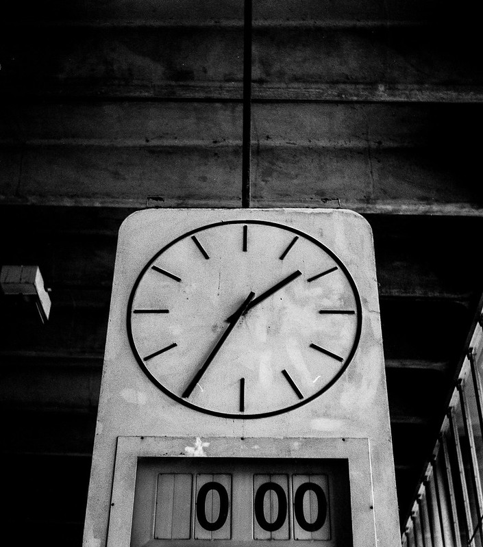
img017 by Gary Sutton, on Flickr
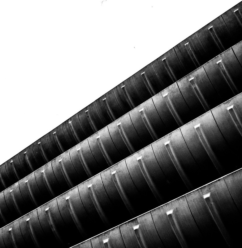
img013 by Gary Sutton, on Flickr
Been a long time since I posted on this thread!
img003 by Gary Sutton, on Flickr
img017 by Gary Sutton, on Flickr
img013 by Gary Sutton, on Flickr
Been a long time since I posted on this thread!
skysh4rk
Suspended / Banned
- Messages
- 3,134
- Name
- RJ
- Edit My Images
- No
I really like the abstract quality of photo 3.
s162216
Suspended / Banned
- Messages
- 2,105
- Name
- Samuel
- Edit My Images
- Yes
Why do colour correction separately for transparencies? I can see the point wiht negatives, because of the varying colour bases. But transparencies are all expected to be projected with the same colour. So why not just do them in Vuescan?
Most likely because unless you've calibrated the scanner using an IT8.7 target then the scan will look probably nothing near the original slide without doing significant PP work to get the colours right (especially the saturation if your using Velvia).
photogav
Suspended / Banned
- Messages
- 194
- Name
- Gavin
- Edit My Images
- Yes
I have just started a Kodak Box Brownie project. I bought a Box Brownie circa 1955 last year for £1.50. I then bought a secondhand scanner for £10.00. The idea is to show that good photography can be both fun and inexpensive. All I pay for is the cost of film.
The camera has no aperture control, no shutter speed control, and no focus control. My pictures are in the hands of George Eastman.
As the project builds I hope to make a short film to show how the shots are taken.
Anyway hope you enjoy these two from the first proper roll of film I put through the camera. And you can see more of my images on my website or Facebook page