Posiview's Photo 52 'Nature' added **FINISHED!!**

Hi Ya Andy


tis a good job I've met you cos that B&W is way to weird....:lol:

Excellent idea for Rapid....as soon as I saw it I thought ....rapidly receeding:lol: The B&W version is my fave...love the detail it brings out....fab work mister :clap:
 
Hi Ya Andy


tis a good job I've met you cos that B&W is way to weird....:lol:

Excellent idea for Rapid....as soon as I saw it I thought ....rapidly receeding:lol: The B&W version is my fave...love the detail it brings out....fab work mister :clap:

Thanks, I feel I've been a bit....:shrug: lately for some reason. This one really perked me up.

:thumbs:
Andy,

:lol: :lol: :lol:

You sure do think 'outside the box' for most of your 52 themes. :lol:

Cheers - that's actually one of the best comments you could give me...:thumbs:
 
The eyes and face lead me to the hair and I thought hair line!
Nice take on the idea.
The B&W is WOW, it really adds texture and depth to the face.
And while we're on the face, I love the expression.

Edit - Oh ye, didn't you say you were going to take your time on this week. If I recall correctly, you posted this one way early in the week.
 
Mentalblock said:
The eyes and face lead me to the hair and I thought hair line!
Nice take on the idea.
The B&W is WOW, it really adds texture and depth to the face.
And while we're on the face, I love the expression.

Edit - Oh ye, didn't you say you were going to take your time on this week. If I recall correctly, you posted this one way early in the week.

....something else of andy's that he's rapidly losing...?? :whistling:
 
A cracking idea Andy. Like the black and white version.

Cheers, it's b@w for me as well.

The eyes and face lead me to the hair and I thought hair line!
Nice take on the idea.
The B&W is WOW, it really adds texture and depth to the face.
And while we're on the face, I love the expression.

Edit - Oh ye, didn't you say you were going to take your time on this week. If I recall correctly, you posted this one way early in the week.

Cheers. I really enjoyed this one.

I'm a carpe diem kinda guy...now where's this week's theme :)
....something else of andy's that he's rapidly losing...?? :whistling:
 
I did my usual after seeing the latest theme, I looked at the definition and while sitting there ruminating I interlaced or wove my fingers together and hey presto, submission #1.

This was more experimenting with my off camera flash. Anyway, just waiting for Jackie to go to bed so I can have a go at a few smoke trails. I have an idea of interweaving :D this week's theme with them..

Best viewed via Flickr direct linky


Weave (backup 2) by andysheader, on Flickr
 
Hiya Andy,

Well .... why am I not surprised at your thought process on this one :clap:

You definitely have a knack for self portraits ... have you ever considered doing portrait/strobis stuff? I think you would be ace at it as you seem to have the creative ideas and could well position your models to suit the ideas you have?

I am always amazed at how you manage to get the idea, position the lighting and get the focus .... and still jump into frame too. That is an art I still have not figured out.

I absolutely love this image .... and for me it fits the theme spot on and is very unique and creative :thumbs:

Cheers

Dawn :)
 
Nice idea Andy.
It looks a little dark on my works monitor, but that's the monitor, I'll check again at home.

My initial thoughts are 2nd strobe required for the head as (monitor aside) I feel more light on your head is required, but not the same level as the hands. I t may look fine once viewed on home monitor.
 
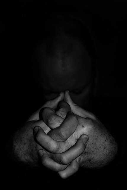
Had a similar thought this morning waiting for the kettle to boil :lol:

Like the focus on the hands ,B&W is great....good work mister but really looking forward to seeing your smoke trails :thumbs:

Smoke trails with a weaver interaction below...plus some script...

Hiya Andy,

Well .... why am I not surprised at your thought process on this one :clap:

You definitely have a knack for self portraits ... have you ever considered doing portrait/strobis stuff? I think you would be ace at it as you seem to have the creative ideas and could well position your models to suit the ideas you have?

I am always amazed at how you manage to get the idea, position the lighting and get the focus .... and still jump into frame too. That is an art I still have not figured out.

I absolutely love this image .... and for me it fits the theme spot on and is very unique and creative :thumbs:

Cheers

Dawn :)

Thanks, Dawn, I feel like I've come out of a slight dip I was in.... :woot:

As bizarre as it sounds, lighting has always been at the bottom of my list; or should I saw flash/strobist stuff....I got a lighting DVD ages ago.....6 hours...I lasted about 10 minutes then turned it off. Might dig it out again.

Weave - great idea, nicely composed, perfect lighting, and looks great in b&w :thumbs:

Thanks Joe.

Nice idea Andy.
It looks a little dark on my works monitor, but that's the monitor, I'll check again at home.

My initial thoughts are 2nd strobe required for the head as (monitor aside) I feel more light on your head is required, but not the same level as the hands. I t may look fine once viewed on home monitor.

2nd strobe....oh, dear, now you've done it :bonk::bonk: I'm on the brink of buying a 105 macro...and Jackie will kick my ar*e if she finds out and now you put 2nd strobe into my compulsive brain....:gag:

It's just about right for me, on my laptop. I didn't want any more light on my head. I'd like a bit more contrast (that is blacker and whiter) than it is but I don't have the software....

Cheers all.
 
Smoke trails....:gag: not easy, especially when you're tired.

I had a really good idea :D in mind but I couldn't pull it off. I wanted the smoke to appear as if it was weaving through the weave of the weaving thing that Jackie's tried doing but it wasn't happening.

Posted one anyway.

#2 and #3, well, again tiredness got the better of me. Done with a laser pen shinning on some black card. NNOOTTT easy. Two takes on weave; and yes, I did have to do a web...:razz: No real C&C needed on the last 2....they were just experimentals.

Well, a quick flick over TP and then bedtime...I'm shattered and poor jackie will wonder where the incense smell has come from.


Weave and smoke by andysheader, on Flickr


Weave ...experimental 2 by andysheader, on Flickr


Weave ...experimental 1 by andysheader, on Flickr
 
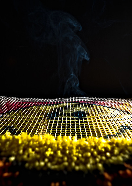
Much better on home monitor, could hardly see it on works monitor
I'm not sure if a touch more light on your head is required now.
As it is the hands stand out which is what you need for the theme.

Macro,
flash,
umbrella
light box
500mm

let me know when to stop!!

For the love of all that's holy please stop....before..eBay.....takes....over....the rational side of my....my....my....brain.......:help::help::help:
 
My smoke trail looks naff on my work's PC....there's hardly any smoke :bonk:

These are addictive...might do some more tonight and possible layer a few/use some sweet rappers for colour.

Cheers.
 
Missed the amoke Andy.
I can see what you were trying to do and it would have been great if it worked!

Silly question maybe, but did you have the smoke under the weavy thing and was the weavy thing flat, as it looks like the smoke is coming out behind the weavy thing.

Looking at the set up, perhaps you should construct a chamber under the weavy thing with for the smoke to build up in, then remove the lid for all the smoke to pass up through the weavy thing?
 
Great work with the smoke trails Andy.

Thanks....work in progress.

Missed the amoke Andy.
I can see what you were trying to do and it would have been great if it worked!

Silly question maybe, but did you have the smoke under the weavy thing and was the weavy thing flat, as it looks like the smoke is coming out behind the weavy thing.

Looking at the set up, perhaps you should construct a chamber under the weavy thing with for the smoke to build up in, then remove the lid for all the smoke to pass up through the weavy thing?

Construct a chamber....nice idea.

I've done some more smoke trails...and might post some...

Cheers.
 
Sometimes, I just can't control myself and wait...:D

I was looking at some old photographs when I saw this one. I photographed the photograph to give it a celestial feel.

This isn't my final post on the theme.


Abstract by andysheader, on Flickr
 
Sometimes, I just can't control myself and wait...:D

I was looking at some old photographs when I saw this one. I photographed the photograph to give it a celestial feel.

This isn't my final post on the theme.

I rather like this, image, the rainbow feel is there and the lurid colours appeal to my quiet character.

Lovely, on theme :thumbs:
 
Hiya Andy,

Having met you at the TP52 meet and knowing what a fantastically creative and artistically talented character you are I have to say I am slightly disappointed by the last 2 theme posts (sorry :'()

I can see what you were trying to achieve with the smoke through the tapestry, which would have been great if accomplished, however I think in your haste the lighting, focus and technique of the smoke filtering through the weave has not worked at all. The smoke trails are the wrong colour (if they had a warmer glow it would of added to the heat/warm glow of the sun rising). If you had managed to get the smoke through the weave, you could then have perhaps cropped the top of the tapestry to just above the sky to give it a more realistic feel.

I'm almost tempted to have a go at this myself .... it would be quite a challenge.

The laser pen shots are not doing much for me at all .... they are very erratic, the web looks slightly OOF and overall they just look too 'bland' to me .... sorry.

Onto Abstract .... now as you have probably established by now ... this is the style of art I am most attracted to. I like the abstract nature of the shot, yet feel it is slightly too noisy for me (if that makes sense). Were you going for an 'eye' ? .... I was thinking that the image would look better positioned as a burning flame .... so a rotation to the right and then a reduction in noise and slight crop ... you would have an ACE image! (oh and clone the slight spot above the blue).

I hope this doesn't all come across as negative critique .... but more constructive.

Your work has been one I have followed with a keen eye and I think the progress, development and learning experience has been a joy for you. Not forgetting to mention that I have learned so much from your progress too.

I am sure you will look back to the start of your Photo52 and appreciate the progress you have made in your learning about photography.

Cheers

Dawn :)
 
Chuffing hell. I posted a long response to Dawn's last post and it's gone...or I didn't submit the reply.

b****r.

Anyway, I edited as Dawn suggested and prefer the burning flame effect.

I also did another edit and damn Flickr has sucked the life out of it. Same photograph, but I photographed some tin foil and overlayed them in post.

I'm still working on some more ideas and have to say I'm finding this one quite difficult....:thinking::thinking:


Abstract by andysheader, on Flickr


43 Abstract Damn Flickr....it's sucked the hell out of the colours!! by andysheader, on Flickr
 
That's an interesting shot, but it's not for me (I'm far too simple). I look forward to your next image.

Hi, Joe, can you expand?? What is it you don't like.

As I said elsewhere, I think this theme may result in more differing opinions than most other themes.

Cheers.
 
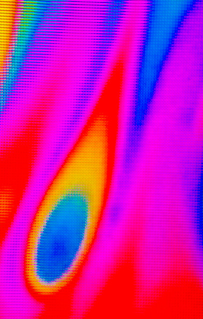
Liming the colours in your first abstract Andy. Your 2nd version is better. The 2nd one which flickr has sucked the colours from looks like it has potential. Some great patterns there.

Cheers, Michael, I'm just looking at abstracts on 500px....wow, there are some really great photographs and it really does show me that there are abstract opportunities everywhere.

I have a feeling this theme many turn into a postfest for me...:naughty:
 
Hiya Andy,

Oooooh, I love your last edit .... now that is abstract, yet one can imagine what it is. I like the warm and cool tones, yet it exudes a certain heat.

Great idea about the use of tin foil, I'll have to remember that .... although I haven't quite got the hang of layers in CS5 yet (in fact I am pretty useless at CS5 fullstop :lol:)

Well done!

Cheers

Dawn :)

Ta very much.
 
Ooooff, not an easy theme, despite my initial exuberance.

Abstract was...everywhere. I was overwhelmed.

But a couple more. You like...:thumbs:....you don't like.....:thumbs:

Thanks for looking.

I've signed up for Kelby Training, and I'm poooooppeedd...been watching hours and videos :gag::gag::gag:

Abstract...I liked this definition:

  • Does not represent the subject in a literal way.
  • Communicates primarily through form, color, and curves rather than image detail.

Cheers.


Water 4 by andysheader, on Flickr


Abstract tests by andysheader, on Flickr
 
andy...:thinking: ...water one looks like Jabba the hutt's reflection if he was able to lean over that far..

BUT!!! :thumbs: the light trail getting jiggly ... awesome..:clap:
 
I like the water one mate... not that im a huge PP fan but on this occasion i'd try to remove the bubbles at the top and foam at the bottom... but love the idea behind this shot!
 
Hi Andy

not sure if I like the water image ....can't put my finger on why as it certainly hits the theme..your light trail ( ? ) abstract though....really works for me, great mix of colors & super dark BG....nice work mister :clap:
 
Back
Top