
OP
posiview
Suspended / Banned
- Messages
- 19,304
- Name
- Andy
- Edit My Images
- Yes
Thanks all. I did notice the contrast was a bit strange but I couldn't work out how to sort it out.
I'll have a play around over the week.
I was/am looking to do a triptych and the subject was domestic violence. I still need to work on it though.
This one was, obviously, of Isabelle hiding out of the way.
I had it both ways: she's a good actress and she was bored silly stuck in the cupboard...
Cheers.


")
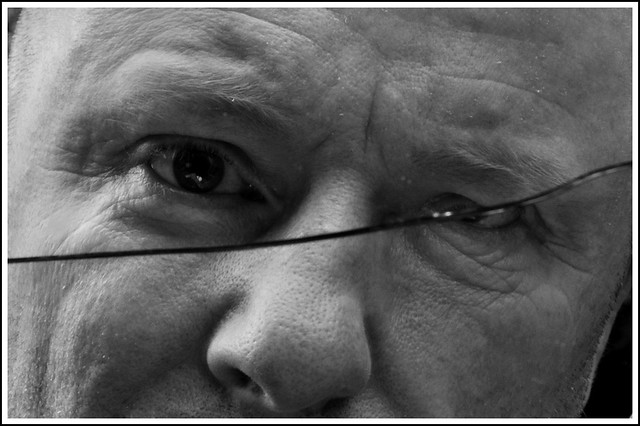

 Much prefer the edited/cropped version...feels far more ...well I dunno really...gritty maybe ? ( I know what I mean , just cant find the right words !) & a mahoosive well done on getting the shot without the camrea reflection anywhere


")


