Pinkbikerbabe
Suspended / Banned
- Messages
- 9,061
- Name
- Mandy
- Edit My Images
- Yes
My vote goes to the first image love the composition and colours.


")
I like the colour in the pipes too tho not keen on the subject
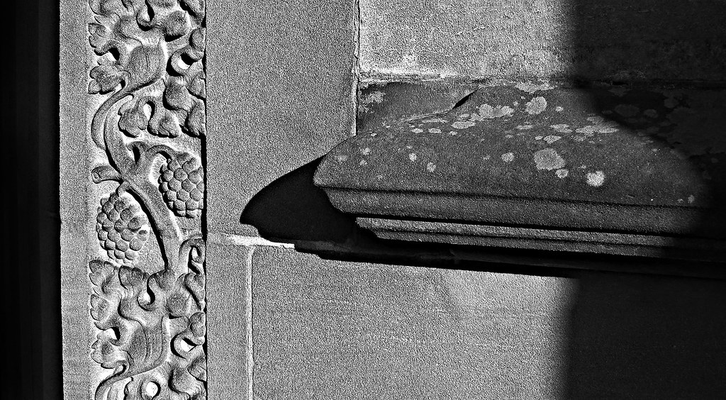
Lovely detail in your mineral shot Mike, not too sure on the left hand shadow, but other than that the shadows of the sill gives great depth - Like it
Sense - Not sure on the crop with the clipped brass bit and the cross that far across... which is a shame as the angle and colours are really nice
Nice colours and the slightly off horizontal approach adds to the image. My eye keeps being drawn to the harsh reflections on the gold bits (I'm sure there's a proper technical term for them) on the left hand side pipes. The crucifix is a nice addition. Was it there originally or did you move it there?
I really like the pipes ....they are such a lovely unusual colour and the gold really stands out, great for an iphone pic, it looks good to me
I like the colour in the pipes too tho not keen on the subject
I have to agree with Judi.
 But you've done well here.
I feel this image would work better if the focus was on the clock rather than the flowers which are very lovely.
I feel this image would work better if the focus was on the clock rather than the flowers which are very lovely.
Ending fits the theme atreat... always hard to get interesting shots of dead things.
Time, "clock time" and "spring time" together... Not sure whre I feel the focus should be, but I like it this way round. Nice bright yellows on the daffs.
Time I agree with Mandy i think that the clock should be in focus, but nice image lovely daffs
I think the clock oof works better... nice use of DOF as you can tell whats in the background which is what Mike is trying to achieve... I think...
Many thanks all for lookingI think the clock oof works better... nice use of DOF as you can tell whats in the background which is what Mike is trying to achieve... I think...
Peter - you noticed the top left corner - I thought I had got away with it.Ending - Fits the theme nicely. I've just spotted the top left corner is missing though.
Time - Clock or daffs in focus? mmmmmm not sure. The yellow, green and brown colours compliment each other nicely.

