
You are using an out of date browser. It may not display this or other websites correctly.
You should upgrade or use an alternative browser.
You should upgrade or use an alternative browser.
Holryn's Photo 52 - Week 25 & 26 added (Grunge/Beginning) - Link in post #1
- Thread starter holryn
- Start date


jeangenie
Suspended / Banned
- Messages
- 3,953
- Name
- Jean
- Edit My Images
- Yes
I love the shot, Paul - the composition, the reflections, the interpretation of the theme and the colour tint (which for some reason reminds me of dilute sulphuric acid in the school chemistry labs!) ....
but .....
I'm nosey, and it's doing my head in that I can't quite read the labels.
Seriously, excellent shot.")
Jean
but .....
I'm nosey, and it's doing my head in that I can't quite read the labels.
Seriously, excellent shot.
Jean
dlh
Suspended / Banned
- Messages
- 1,780
- Name
- Darren
- Edit My Images
- Yes
I like that. The reflection and composition are great. The tint is a little too much for me, but it works nonetheless. And I too am trying to read the labels and can only understand alcohol, water and perfume. Nice addition to your 52 
68lbs
Suspended / Banned
- Messages
- 5,450
- Name
- April 2008
- Edit My Images
- No
You've heard of a tobacco filter... this was taken using a urine filter...
But I like it, despite (or perhaps because of) the colour. Are they just little perfume sample bottles? Kinda clever idea. Love the light in the background. Is it coming through some louvered blinds?
But I like it, despite (or perhaps because of) the colour. Are they just little perfume sample bottles? Kinda clever idea. Love the light in the background. Is it coming through some louvered blinds?
philthejuggler
Suspended / Banned
- Messages
- 7,086
- Name
- Phil
- Edit My Images
- Yes
Great lighting and composition!
Phil
Phil
OP
holryn
Suspended / Banned
- Messages
- 803
- Name
- Paul
- Edit My Images
- Yes
I love the shot, Paul - the composition, the reflections, the interpretation of the theme and the colour tint (which for some reason reminds me of dilute sulphuric acid in the school chemistry labs!) ....
but .....
I'm nosey, and it's doing my head in that I can't quite read the labels.
Seriously, excellent shot.
Jean
Thanks again Jean.
I like that. The reflection and composition are great. The tint is a little too much for me, but it works nonetheless. And I too am trying to read the labels and can only understand alcohol, water and perfume. Nice addition to your 52
Thanks Darren. Went for a bluer tint at first but didn't like it as much.
This is what is on the side of the vials (bearing in mind they are only 1.5" tall):
U by Ungaro for Him Eau de Toilette Spray
SD ALCOHOL 40-B
WATER/EAU
PARFUM/FRAGRANCE
BENZOPHENONE-1
TRIS(TETRAMETHYLHYDROXYPIPERIDINOL) CITRATE
BETA-CAROTENE
RED 4/CI 14700
BLUE 1/CI 42090
EXT. VIOLET 2/CI 60730
YELLOW 10/CI 47005
The bottle standing on the right contains a sample of Christian Lacroix Noir and so contains different ingredients.
Hahaha - cheers Lee - that made me laugh out loud.You've heard of a tobacco filter... this was taken using a urine filter...
But I like it, despite (or perhaps because of) the colour. Are they just little perfume sample bottles? Kinda clever idea. Love the light in the background. Is it coming through some louvered blinds?
Spot on - they are indeed mini perfume/aftershave samples.
The set up was quite simple - a plain A4 piece of white paper, on which I put a piece of glass from a 6X4 photo frame. Arranged the composition and took the photo. The light was just natural light coming through a venetian blind
 . Added the 'Urine' tint in CS4.
Great lighting and composition!
Phil
Thank Phil.
jennyb
Suspended / Banned
- Messages
- 1,730
- Name
- Jenny
- Edit My Images
- Yes
Hi Paul, I somehow seem to have missed your thread previously. I just love your chemistry shot. I love the tint (very "chemical" or "urine", as Lee says). The chemy labs at our school always smelled a bit "uriney" I really like the lighting with the blinds. Excellent Take on the theme.
Jenny
I really like the lighting with the blinds. Excellent Take on the theme.Jenny
OP
holryn
Suspended / Banned
- Messages
- 803
- Name
- Paul
- Edit My Images
- Yes
Well the urine tint is certainly different! I quite like it - the reflections work well and you can see the shape of the blind in the as well.
Like your 3rd crop for Play the best I think. Really nice shot, well lit.
Thanks Dave. The shape of the blind wasn't intentionally at first but I'm very please it is there.
Interesting and intreaging, seems sharp without being sharp to me anyway :shrug:
After looking for a while the Yellow treatment works well.
Thanks for the comments Allan.
Interesting colours on this, i quite like them. I think the dropper has got a bit lost in the shot though, maybe if it were leading into the photo the other way it would bring it out a bit more.
Cheers Chris. That didn't occur to me until you mentioned it.
Hi Paul, I somehow seem to have missed your thread previously. I just love your chemistry shot. I love the tint (very "chemical" or "urine", as Lee says). The chemy labs at our school always smelled a bit "uriney"
Jenny
Thanks Jenny.
This is really effective
Cheers Tracer.
foggy4ever
Suspended / Banned
- Messages
- 5,735
- Name
- Storm Trooper
- Edit My Images
- Yes
Hi Paul catch up time
The mechanical shot is great, it looks like a product shot very well lit.
Chess seems to be popular this week. Like the way the player is sharp and the board nice and soft in the background. I prefer the first crop that is a little tighter with more cropped off the top right of the board.
The chemistry shot is nice and simply put together, the yellow tint is a little unusual but works well.

- Messages
- 13,060
- Name
- Sarah
- Edit My Images
- No
It had to be Lee didn't it?Last year the phrase "crowbarred" was introduced into the 52 vocabulary and this year it's "urine filter"

Whatever you want to call it, I actually really like the colour tint on your chemistry shot. The bottles are brilliantly sharp (I can almost read the writing and that's amazing considering how small they are) and I just love the lighting and reflections.
In fact, there's not anything I don't like about this one. Top shot!!!
The square crop on play really works for me and it's definitely no.2 out of that set.
The first one cuts a bit too much off the RHS of the board. And I find that the first one doesn't quite have enough of her head in frame and there's a bit too much empty space on the right.
The second one is just spot on.
And finally, candid.
This made me smile too
It's a lovely summery shot and the colours really are really making me think about the sun.
Lovely and crisp again - and the way that she's sat with that hat is brilliant
- Messages
- 12,646
- Name
- John
- Edit My Images
- Yes
Paul, I like chemistry... the feel of it, and the processing makes me think there's something rather noxious and horrible in the bottles... although I was trying to read them too..
Candid a lovely shot. Excellent colours and crisp and clear. The angle of the hat, really helps with the feeling of candidness
Candid a lovely shot. Excellent colours and crisp and clear. The angle of the hat, really helps with the feeling of candidness
OP
holryn
Suspended / Banned
- Messages
- 803
- Name
- Paul
- Edit My Images
- Yes
Last year the phrase "crowbarred" was introduced into the 52 vocabulary and this year it's "urine filter"
Whatever you want to call it, I actually really like the colour tint on your chemistry shot. The bottles are brilliantly sharp (I can almost read the writing and that's amazing considering how small they are) and I just love the lighting and reflections.
In fact, there's not anything I don't like about this one. Top shot!!!
Well, maybe I should use the 'Urine filter' some more. That one was done in Photoshop, but I've been playing with some filters lately - well Quality Street wrappers really but they do the same job. The square crop on play really works for me and it's definitely no.2 out of that set.
The first one cuts a bit too much off the RHS of the board. And I find that the first one doesn't quite have enough of her head in frame and there's a bit too much empty space on the right.
The second one is just spot on.
Thanks.
And finally, candid.
This made me smile too
It's a lovely summery shot and the colours really are really making me think about the sun.
Lovely and crisp again - and the way that she's sat with that hat is brilliant
As I said , it was a bit of a cop out as it was taken a few years ago. Was sat on the beach and called out to her snapped it as she looked up.
Paul, I like chemistry... the feel of it, and the processing makes me think there's something rather noxious and horrible in the bottles... although I was trying to read them too..
Thanks John. I thought it gave the shot a sort of 'lab' feel.
Candid a lovely shot. Excellent colours and crisp and clear. The angle of the hat, really helps with the feeling of candidness
Not bad for a 2 Mega Pixel P&S.
 ).
). 

davidh6781
Suspended / Banned
- Messages
- 1,181
- Name
- David
- Edit My Images
- Yes
Paul, my personal choice would be the first "Produce" shot feels warm and the DOF is ace.
I don't feel left out now, i put mine up today and thought i was the only one.
I don't feel left out now, i put mine up today and thought i was the only one.
68lbs
Suspended / Banned
- Messages
- 5,450
- Name
- April 2008
- Edit My Images
- No
It had to be Lee didn't it?
Excuse me? And what does that mean?
Ignoring your 'produce shot' below (I haven't seen it), and going back to candid... I really like that. Incredibly simple, but it's one of those moments that I think we can all relate to... where you just sort of drift off into a world of your own and start doing something a little odd or daft. I spontaneously burst into some sort of weird singing at one point today!

Awww - "Candid" is a lovely shot, and one to treasure. And proof yet again that you don't need an expensive camera!
"Produce" - I really like the warm colours and narrow DOF on the first one. The second is clever too but doesn't work so well for me. I think maybe it is a bit harsh and doesn't convey a sense of celebration.
"Produce" - I really like the warm colours and narrow DOF on the first one.
The second is clever too but doesn't work so well for me. I think maybe it is a bit harsh and doesn't convey a sense of celebration.
OP
holryn
Suspended / Banned
- Messages
- 803
- Name
- Paul
- Edit My Images
- Yes
Paul, my personal choice would be the first "Produce" shot feels warm and the DOF is ace.
I don't feel left out now, i put mine up today and thought i was the only one.
Thanks David. I like the warmth of the first shot too. Thought I'd get a shot in early in the week for once as I have some rare time off.
I can't put my finger on why I like the first shot best but I do :shrug:
Allan
Thanks Allan.
Excuse me? And what does that mean?
Ignoring your 'produce shot' below (I haven't seen it), and going back to candid... I really like that. Incredibly simple, but it's one of those moments that I think we can all relate to... where you just sort of drift off into a world of your own and start doing something a little odd or daft. I spontaneously burst into some sort of weird singing at one point today!
Cheers Lee - Are you ignoring my produce shot on purpose?

Awww - "Candid" is a lovely shot, and one to treasure. And proof yet again that you don't need an expensive camera!
"Produce" - I really like the warm colours and narrow DOF on the first one.
Thanks Tracer. That was my first digital camera if I remember correctly - had it for years too.
I think you're right with the 'Produce' shot.
68lbs
Suspended / Banned
- Messages
- 5,450
- Name
- April 2008
- Edit My Images
- No
Cheers Lee - Are you ignoring my produce shot on purpose?
In a word... yes!
Haven't done mine yet so don't want to be influenced too much by what I see from others.
")
jeangenie
Suspended / Banned
- Messages
- 3,953
- Name
- Jean
- Edit My Images
- Yes
Candid: I'd love to see this really large and cropped in hard to the delightful model! A gorgeous shot, Paul.
Produce: I'd chose the first one (well, actually, I'd choose any bottle of bubbly if it were offered) because the colour suggests fine champagne, aged and stored in a cool dark cellar, just waiting for the right moment to be brought into the light and opened to release those dancing golden little bubbles ......
ok, so I've got a wierd imagination, but I do really like that first shot.
Jean
Produce: I'd chose the first one (well, actually, I'd choose any bottle of bubbly if it were offered
) because the colour suggests fine champagne, aged and stored in a cool dark cellar, just waiting for the right moment to be brought into the light and opened to release those dancing golden little bubbles ...... ok, so I've got a wierd imagination, but I do really like that first shot.
Jean
- Messages
- 13,060
- Name
- Sarah
- Edit My Images
- No
First one for me too (but like Jean, if you're offering I won't turn down the second either )
You may not feel like you've challenged yourself much with this, but the end result has worked brilliantly.
That warm glow in the label and the background really draws me in.
The angle, DoF and crop that you've chosen all work well. All in all I really like it
)You may not feel like you've challenged yourself much with this, but the end result has worked brilliantly.
That warm glow in the label and the background really draws me in.
The angle, DoF and crop that you've chosen all work well. All in all I really like it
OP
holryn
Suspended / Banned
- Messages
- 803
- Name
- Paul
- Edit My Images
- Yes
They are both good and excellent takes on the them, I think the first is better, the colours make it much warmer.
Thanks John.
Candid: I'd love to see this really large and cropped in hard to the delightful model! A gorgeous shot, Paul.
Produce: I'd chose the first one (well, actually, I'd choose any bottle of bubbly if it were offered
ok, so I've got a wierd imagination, but I do really like that first shot.
Jean
Nice one Jean. I'm not sure the candid shot would take the crop - it was taken on a 2MP camera so probably wouldn't blow up too well :shake:First one for me too (but like Jean, if you're offering I won't turn down the second either
You may not feel like you've challenged yourself much with this, but the end result has worked brilliantly.
That warm glow in the label and the background really draws me in.
The angle, DoF and crop that you've chosen all work well. All in all I really like it
Thanks Sarah. Having trouble getting out and about - just too busy! Having to find subjects closer to home.
OP
holryn
Suspended / Banned
- Messages
- 803
- Name
- Paul
- Edit My Images
- Yes
Having to catch up again this week.
Here's my shot for week 13 - Quad. I just happen to have a load of old computer components knocking about - one of which happened to be an old Quad speed CD-ROM drive.
Quad

For my re shoot I decided to have another go at Mechanical. So here is a mechanical pencil. Not the most inspiring of shots I know.
Mechanical Re shoot

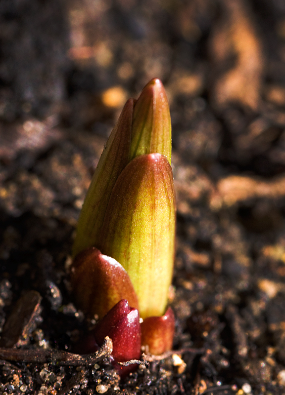
And so onto Week 14 and Shoot. I managed to get a couple of minutes in the garden.
Shoot
So up to date again (at last).
Here's my shot for week 13 - Quad. I just happen to have a load of old computer components knocking about - one of which happened to be an old Quad speed CD-ROM drive.
Quad
For my re shoot I decided to have another go at Mechanical. So here is a mechanical pencil. Not the most inspiring of shots I know.
Mechanical Re shoot
And so onto Week 14 and Shoot. I managed to get a couple of minutes in the garden.
Shoot
So up to date again (at last).
jeangenie
Suspended / Banned
- Messages
- 3,953
- Name
- Jean
- Edit My Images
- Yes
I'm trying to look at Quad and the Reshoot without seeing Shoot as well, because I still have no idea what I'm going to do!
Quad: What goes on inside my computer tower is a bit of a mystery to me, so I definitely wouldn't thought of this for Quad. But it definitely qualifies for the theme.
I like the way you've lit it and angled the reflection, the colours look good and I'm sure if this were an advert it would sell the product.
Reshoot: Ah, more technology! An excellent shot, sharp (in both senses!) good composition and the background adds interest without detracting from the subject. Another from me.
Jean
Quad: What goes on inside my computer tower is a bit of a mystery to me, so I definitely wouldn't thought of this for Quad. But it definitely qualifies for the theme.
I like the way you've lit it and angled the reflection, the colours look good and I'm sure if this were an advert it would sell the product.
Reshoot: Ah, more technology!
An excellent shot, sharp (in both senses!) good composition and the background adds interest without detracting from the subject. Another from me. Jean
foggy4ever
Suspended / Banned
- Messages
- 5,735
- Name
- Storm Trooper
- Edit My Images
- Yes
I can understand why you chose that shot for Candid it made me smile too.
Love the Produce shot, nice use of DOF and the angle and lighting work are just right.
The Quad is another shot which stands out due to the selective lighting.
A new shoot is a perfect fit for this weeks theme.
Love the Produce shot, nice use of DOF and the angle and lighting work are just right.
The Quad is another shot which stands out due to the selective lighting.
A new shoot is a perfect fit for this weeks theme.
OP
holryn
Suspended / Banned
- Messages
- 803
- Name
- Paul
- Edit My Images
- Yes
I'm trying to look at Quad and the Reshoot without seeing Shoot as well, because I still have no idea what I'm going to do!
Quad: What goes on inside my computer tower is a bit of a mystery to me, so I definitely wouldn't thought of this for Quad. But it definitely qualifies for the theme.
I like the way you've lit it and angled the reflection, the colours look good and I'm sure if this were an advert it would sell the product.
Reshoot: Ah, more technology!
Jean
Thanks Jean. With Quad I tried the old trusty 'stick-it-on-an-old-cd' method
I can understand why you chose that shot for Candid it made me smile too.
Love the Produce shot, nice use of DOF and the angle and lighting work are just right.
The Quad is another shot which stands out due to the selective lighting.
A new shoot is a perfect fit for this weeks theme.
Thanks Scott.
Excellent lighting and clean, simple composition on 'Quad' and 'Mechanical'.
'Shoot' certainly fits the theme. It is just slightly soft on my screen, though - the focus seems to be on the compost just in front.
Thanks guys. Looks like not quite enough DOF used. I tried to get the main shoot in focus and sharp - just fallen a little short.Quad is excellent and works very well... Reshoot, that's a great take on the theme... Shoot fits the theme, but I have to agree it looks a little out.
The23rdman
Suspended / Banned
- Messages
- 13,582
- Name
- Dean
- Edit My Images
- No
Really good idea for the shoot shot (try saying that fast!). Seasonal and topical!
OP
holryn
Suspended / Banned
- Messages
- 803
- Name
- Paul
- Edit My Images
- Yes
Really good idea for the shoot shot (try saying that fast!). Seasonal and topical!
Cheers Dean - I did a couple of different ones. Not many new shoots around they've either been and gone or just not happened yet.
- Messages
- 13,060
- Name
- Sarah
- Edit My Images
- No
Quad really stands out for me.
Until I read the description I had no idea what it was, but I knew that I liked it . . . a lot.
Fantastic lighting (really sets it off); good colour and I like the reflection.
Normally I'd complain about part of the reflection being chopped off, but in this one I think it works.
Mechanical : technically a very good shot, but maybe not the most exciting in terms of subject matter.
It works though, nice and sharp and I really like the blue coming in from the bottom LHS.
Shoot : Bang on theme. Well executed and lovely colours. Another from me.
Until I read the description I had no idea what it was, but I knew that I liked it . . . a lot.
Fantastic lighting (really sets it off); good colour and I like the reflection.
Normally I'd complain about part of the reflection being chopped off, but in this one I think it works.
Mechanical : technically a very good shot, but maybe not the most exciting in terms of subject matter.
It works though, nice and sharp and I really like the blue coming in from the bottom LHS.
Shoot : Bang on theme. Well executed and lovely colours. Another
from me.