Holryn's Photo 52 - Week 25 & 26 added (Grunge/Beginning) - Link in post #1

Love mechanical, shoot is good from a lighting perspective but needs a little more dof!

Phil
 
Quad really stands out for me.
Until I read the description I had no idea what it was, but I knew that I liked it . . . a lot.
Fantastic lighting (really sets it off); good colour and I like the reflection.
Normally I'd complain about part of the reflection being chopped off, but in this one I think it works.

Mechanical : technically a very good shot, but maybe not the most exciting in terms of subject matter.
It works though, nice and sharp and I really like the blue coming in from the bottom LHS.

Shoot : Bang on theme. Well executed and lovely colours. Another :thumbs: from me.

Shoot: Very nice indeed! The colours are great and it feels as though the sun's shining on the fresh new shoot. The composition works well, with good bokeh. Did I say the colours are great, too? :D :clap::clap:

Jean

Love mechanical, shoot is good from a lighting perspective but needs a little more dof!

Phil

Thanks for all the comments guys.
 
There's some really nice stuff in this 52 IMHO! Sadly, too many for me to comment on individualy (apologies for that!), but theres a very good standard of work going on in general, and your week 15 "Single" is very nice....look forward to following this, keep it up! :clap:
 
I really like your shot for single - the mono conversion works really well, largely because the sky has plenty of cloud detail.

Phil
 
There's some really nice stuff in this 52 IMHO! Sadly, too many for me to comment on individualy (apologies for that!), but theres a very good standard of work going on in general, and your week 15 "Single" is very nice....look forward to following this, keep it up! :clap:


Thanks for the kind comments Damien. I'm finding it very difficult to keep up with everyone elses shot too. I appreciate you taking the time to comment.


Yep that definitely works.
The border sets it off nicely, but it really is a good shot to start with.

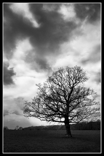
The moody sky is beautiful and I like the simplicity of the single tree. B&W conversion suits it too :thumbs:

As always, thanks for the comment Sarah.

lovely image and the mono treatment makes for a great moody sky,

Cheers Chris

I really like your shot for single - the mono conversion works really well, largely because the sky has plenty of cloud detail.

Phil

Thanks Phil.
 
Hi Paul,

Catching up with comments for me... Busy times recently.

Chemistry: Very nice & clinical. Good composition that works well.

Candid: Good composition and an amusing shot.

Produce: I really like the B&W on this one. You can really tell the "slice" of DoF. Love the texture and composition again.

Quad/Reshoot: I love your reshoot of Mechanical with the clutch pencil. Focus is spot on.

Shoot: Doesn't get more on-topic than this and I live nature shots. I think this is a really good example of Spring as well as a "shoot". looks almost alien!

Single: This is the best of all the shots I've reviewed here. Nice simple border works well, and the silhouette of the tree is well composed (again) in the frame. The sky is a tad blown in places and I'd be tempted to try and reign it in a bit, but it works nonetheless.

Ian.
 
Well done on that Quad picture. It actually makes it look modern :lol:

Really like your Single tree as well. Nice brooding clouds and a good mono conversion. The border works well with it too.
 
Hi Paul,

Catching up with comments for me... Busy times recently.

Chemistry: Very nice & clinical. Good composition that works well.

Candid: Good composition and an amusing shot.

Produce: I really like the B&W on this one. You can really tell the "slice" of DoF. Love the texture and composition again.

Quad/Reshoot: I love your reshoot of Mechanical with the clutch pencil. Focus is spot on.

Shoot: Doesn't get more on-topic than this and I live nature shots. I think this is a really good example of Spring as well as a "shoot". looks almost alien!

Single: This is the best of all the shots I've reviewed here. Nice simple border works well, and the silhouette of the tree is well composed (again) in the frame. The sky is a tad blown in places and I'd be tempted to try and reign it in a bit, but it works nonetheless.

Ian.

Wow. Thanks for the catchup Ian.

I think I may have gone a touch overboard with the dodge and burning on the clouds on the tree shot.
 
Well done on that Quad picture. It actually makes it look modern :lol:

Really like your Single tree as well. Nice brooding clouds and a good mono conversion. The border works well with it too.

Thanks Steve. I am quite pleased with the way Quad turned out.

Lovely sky!!.....Very nice shot works very well :thumbs:

Thanks Sonia.

Excellent tree and sky, and B&W conversion works really well.

Cheers Tracer.
 
Well I wanted to get this one in early - I can imagine there will be quite a few similar this week, although the real reason is that I have done my first ever self portrait and I wanted to put it up before I chickened out and changed my mind.


Comments appreciated as always.
 
Single: What works really well for me in this Paul, is the way the lighter areas of the sky almost outline the tree, with just a little light at the horizon to add impact. The conversion is excellent - and so is the border (but be warned, they can become addictive! :lol:)

One very small niggle, though - the right hand side is cropped a little hard against the edge of the tree (but I realise there might have been something in the way!) All in all, a good take on the theme and a good result! I hope the exam is also a good result. :)

Jean

Thanks Jean. I will take note of the border issue :D.

You are right about the right hand side - there was another tree creeping into the frame (which I cloned out), so the crop was a little tight.

And yes the exam went really well thanks.
 
:thumbs::thumbs::thumbs: 2nd of many similar pics (well first self portrait one!) I got a "model" for mine!

Just flicking through your 52 and some nice pics in there...........
 
:thumbs::thumbs::thumbs: 2nd of many similar pics (well first self portrait one!) I got a "model" for mine!

Just flicking through your 52 and some nice pics in there...........

Thanks Lynton. I figured this might be the case. Off to check out your thread...
 
. oops done it again!!! too many clickk on refresh!
 
Last edited:
Paul I like the "Single" shot works well, sky has moody feel to it. nice.

"Stare" has a good feel also. very (no pun) in your face mood. I have completed my stare just not put it on yet.
 
Single is excellent, a very moody sky and the skeletal nature of the tree works very well in B&W. The only thing I'd like to see is a little separation between the lower branches and the background, maybe a little lower on the shot...

Stare, very moody, good feel to it (not sure good is the right word there... but I'm sure you get what I mean ... ;))...
 
Paul I like the "Single" shot works well, sky has moody feel to it. nice.

"Stare" has a good feel also. very (no pun) in your face mood. I have completed my stare just not put it on yet.

Thanks David

Single is excellent, a very moody sky and the skeletal nature of the tree works very well in B&W. The only thing I'd like to see is a little separation between the lower branches and the background, maybe a little lower on the shot...

Stare, very moody, good feel to it (not sure good is the right word there... but I'm sure you get what I mean ... ;))...

Thanks John. Noted your comments regarding the lower branches in the tree shot. :thumbs:
 
Single - really nice strong image. Black and white, moody sky and the border all make for a cracking photo. Well done :thumbs:

Stare - I don't think that there are going to be many variations on this weeks theme somehow ;) The difference will be how well they are done. This is excellent. The lighting makes you look really mean and imposing. Black and white emphasises that.

Andy

Thanks Andy.
 
Good work on stare, your shot is actually how I pictured mine coming out but I really struggled to get the lighting right with just white light so ended up playing with colours and different poses for mine.

Well done, how did you achieve the lighting, if you don't mind revealing?
 
Good work on stare, your shot is actually how I pictured mine coming out but I really struggled to get the lighting right with just white light so ended up playing with colours and different poses for mine.

Well done, how did you achieve the lighting, if you don't mind revealing?

Thanks Gary. No I don't mind revealing how I took the shot - nothing at all complicated - not even a flash. I took it about 8am Monday morning. I had the day off as the airport was shut because of the volcano. The light is all natural sunshine coming through the blinds. The rest was done in PP.

I created a vignette to cover most of the shot outside of the face then dodged and burned here and there - in particular lightened around the eyes and across the bridge of the nose.

The shot was just me holding the camera, pointing it towards myself from a slightly higher vantage point and hoping the autofocus got my eyes. Took about three or four shots.

Hope this helps.
 
I like it. Moody.

Well composed and I do like the subdued/dark lighting coupled with the catchlights.

:thumbs:

Ian.
 
Ooooerrrr - I wouldn't like to meet you on a dark night! That is a really good moody shot - the lighting is spot on. :clap::clap:
 
I love the dark PP on stare - and you've managed to get your eyes amazingly sharp. Not easy in a self portrait :thumbs:

I don't know whether it's the angle or the PP, but it's got a real 3D quality. I feel like you're about to lean right out of the screen.
Very moody and very effective.

I'm glad you didn't chicken out and take it down.
 
Here is Indulgence. A nice expensive bottle of Cristal Champagne. (Borrowed from my wifes work :D)


This is Close. I like the colours in this one.

 
My take on Ingredients. My daughters have been baking this week.


This is my Reshoot for Poem. I was looking through some photos from my Dads funeral and decided to incorporate a picture with the verse that was read at his service.

 
I decided to Stop time for this one. A stopwatch!

 
I couldn't think of anything for this week, but settled on the possible thoughts and feelings of those unfortunate enough to go through Traitors Gate.

 
Following on from my Indulgence shot - another shot of that Quality champagne.


Well it's been a long few weeks since I've even managed to pick up the camera, let alone get on here and see everyone's work. Apologies for not commenting. Hopefully now I am all caught up with my shots I can begin to look through the backlog.
 
Paul,

Glad you're back and life seems back to normal.........


Indulgence - beautifully composed and lit. Great idea. What's in the glasses though as the cork is still in the Cristal. I hope you've not tried to pass off an inferior glass of bubbles........:lol:

Ingredients - again great lighting - i am assuming natural through the window and the shallow DOF works well in this pic. What was the result like?

Reshoot of Poem - Obviously by the picture something EXTREMELY personal, I would say a rare occasion where selcective colouring works, but am not sure about the overlaying of so much text over a picture already full of detail...... Just my tuppence worth...... but a clever take on the theme that demonstrates ability to use your editing software.

Stop - Simple but effective. :thumbs: I was scratching my head for ages on this one.

Isolation - That is one intimidating gate. Yet to visit the Tower of London. Need to do it, but the crowds and hoards of tourists put me off.........

Quality - another simple yet effective take on the theme. When are you going to open it ??????


Good catch up there, and welcome back.
 
Back
Top