
You are using an out of date browser. It may not display this or other websites correctly.
You should upgrade or use an alternative browser.
You should upgrade or use an alternative browser.
Holryn's Photo 52 - Week 25 & 26 added (Grunge/Beginning) - Link in post #1
- Thread starter holryn
- Start date
OP
holryn
Suspended / Banned
- Messages
- 803
- Name
- Paul
- Edit My Images
- Yes
Very clever and inventive interpretation of the theme.
Good composition of the various elements in the frame and lovely clean. crisp details.
To pick up 2 of the points already made above :
- I'd really like to see the board on a more contrasting surface.
- It would be nice to see how it looked in more dramatic lighting. It looks to me like this was shot in natural light coming from a door/window to the top right?
It's given you nice even lighting and minimal shadows, but I think this might benefit from something with a bit more punch.
If you only have onboard flash, have a play with household lighting items like torches and desklamps.
The advantage with still life is that you can use a tripod (or anything to rest the camera on to keep it steady) to experiment with longer exposures and get different effects. And you don't need anything more than black and white card to experiment with controlling where the light hits.
Thanks Sarah, I appreciate you taking the time to comment. Will give this another try at some point and have a 'play' with the lighting as suggested.
I am beginning to think that as I go through this 52 and pick up tips and (hopefully) learn things that I might reshoot some, if not all, and put that learning into practice

OP
holryn
Suspended / Banned
- Messages
- 803
- Name
- Paul
- Edit My Images
- Yes
week 3 looks good
love the idea and composition
a touch more contrast perhaps? :shrug:
each week better than the one before
Thanks Mike - Agreed needs a bit more 'punch'.
I'm liking
Terran
Thanks Terran
Paul, Poem works really well, lovely colours and defintion. Excellent for chopped well thought out, and a great idea.
Thank you John.
OP
holryn
Suspended / Banned
- Messages
- 803
- Name
- Paul
- Edit My Images
- Yes
Well - I've got to say I've struggled this week - combination of imagination and lack of time due to being busy with others things. So unfortunately a bit of a cheat as the shot was taken some time ago (and on my phone  )
)
I'm still undecided with which version to go for so have posted both:

I'm not 100% comfortable doing this type of photography, especially when I'm on my own, but I suppose the more I get out there and do it the better I will feel about it.
)I'm still undecided with which version to go for so have posted both:
I'm not 100% comfortable doing this type of photography, especially when I'm on my own, but I suppose the more I get out there and do it the better I will feel about it.
Ian_Wilson
Suspended / Banned
- Messages
- 200
- Edit My Images
- Yes
i like the colour version best.
I have shot there and the lines and perspective are brilliant. How did you manage to get rid of all the people??
If I was to go back I'd probably play around with different angles and postions fpr the vanishing point, now I know what a powerful compositional feature it is. You have placed it on the line of third on the vertical, andl half way up the frame, and I think it works as it balances the land and sky proportions.
OP
holryn
Suspended / Banned
- Messages
- 803
- Name
- Paul
- Edit My Images
- Yes
i like the colour version best.
I have shot there and the lines and perspective are brilliant. How did you manage to get rid of all the people??
Thanks Ian.
I guess I got lucky - it was middle of the day sometime in July
If I was to go back I'd probably play around with different angles and postions fpr the vanishing point, now I know what a powerful compositional feature it is. You have placed it on the line of third on the vertical, andl half way up the frame, and I think it works as it balances the land and sky proportions.
Was thinking maybe could have shot it lower down.
jeangenie
Suspended / Banned
- Messages
- 3,953
- Name
- Jean
- Edit My Images
- Yes
Hi Paul - Sorry I haven't vivisted your thread earlier - there are such a lot and I can't keep up!
Week 1: Lovely curves - and I like the lighting, too. Excellent start.")
Week 2: You can't fail with orchids. Nicely done and well matched with the poem.
Week 3: Very clever, Paul. I like the subdued colours - they have a very natural feel to them - but I also think I could work with a colour boost. A win-win, imho.
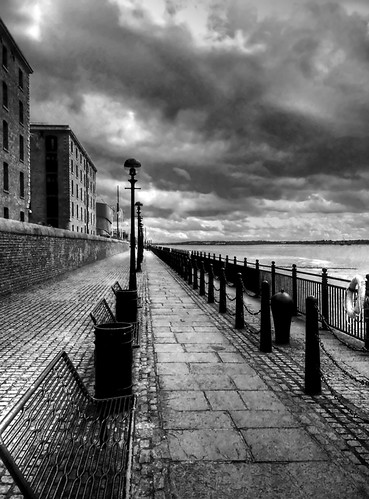
Week 4: You've obviously got a good phone! Well observed and all those lines disappearing into the horizon somehow reminds me of school art classes on perspective - really difficult to get right. I prefer the b&w - just personal taste, but depsite the modern bins and benches the mono version has a kind of 1930s look. I like.
Jean
Week 1: Lovely curves - and I like the lighting, too. Excellent start.
Week 2: You can't fail with orchids. Nicely done and well matched with the poem.
Week 3: Very clever, Paul.
I like the subdued colours - they have a very natural feel to them - but I also think I could work with a colour boost. A win-win, imho.Week 4: You've obviously got a good phone! Well observed and all those lines disappearing into the horizon somehow reminds me of school art classes on perspective - really difficult to get right. I prefer the b&w - just personal taste, but depsite the modern bins and benches the mono version has a kind of 1930s look. I like.
Jean
I'm not usually a fan of HDR and find the colours a bit odd, so I much prefer the mono one. I'd like to see a distant figure or two just to give a sense of scale but otherwise I like the composition as it is - a lower viewpoint would lose some of the cobbles and paving stones with their interesting textures.
Rob Bartley
Suspended / Banned
- Messages
- 193
- Edit My Images
- No
Hi Paul. My vote goes for the B+W version. The HDR of the clouds is amazing.
Cheers, Rob
Cheers, Rob
TheThistle
Suspended / Banned
- Messages
- 1,556
- Name
- Graham
- Edit My Images
- Yes
Camera photo - that is superb, its another vote for B&W version
- Messages
- 13,060
- Name
- Sarah
- Edit My Images
- No

OK . . . you're not 100% comfortable with this type of photography and you shot that with your phone . . . it's absolutely superb!
I'm completely willing to forgive you for posting an old shot, because I think this is just beautiful.
Composition is spot on, lovely sense of perspective and great contrasting textures between the brickwork and the benches.
I'm going against the crowd and saying that I prefer the colour version.
Normally I don't like HDR very much . . . normally if there's an HDR shot that I do like it's in B&W . . . but I like the colour one here.
I think because the tones are all quite subdued and earthy anyway and I do like that splash of orange on the RHS.
dlh
Suspended / Banned
- Messages
- 1,780
- Name
- Darren
- Edit My Images
- Yes
I'm finding it hard to believe that was taken on a phone (not that I don't believe you I just find it hard to comprehend how it's better than anything I can manage with a DSLR!)
I really like what you've done with the colour version here and the lines heading into the shot remind me of a tempest 2000 game. Stunning.
What phone is it? Think I need an upgrade from my Canon")
I really like what you've done with the colour version here and the lines heading into the shot remind me of a tempest 2000 game. Stunning.
What phone is it? Think I need an upgrade from my Canon
OP
holryn
Suspended / Banned
- Messages
- 803
- Name
- Paul
- Edit My Images
- Yes
Hi Paul - Sorry I haven't vivisted your thread earlier - there are such a lot and I can't keep up!
Thanks Jean - keeping up with my own thread is hard enough, trying to look at others as much as possible though.
Week 1: Lovely curves - and I like the lighting, too. Excellent start.
Week 2: You can't fail with orchids. Nicely done and well matched with the poem.
Week 3: Very clever, Paul.
Week 4: You've obviously got a good phone! Well observed and all those lines disappearing into the horizon somehow reminds me of school art classes on perspective - really difficult to get right. I prefer the b&w - just personal taste, but depsite the modern bins and benches the mono version has a kind of 1930s look. I like.
Jean
Thanks.
OP
holryn
Suspended / Banned
- Messages
- 803
- Name
- Paul
- Edit My Images
- Yes
I'm not usually a fan of HDR and find the colours a bit odd, so I much prefer the mono one. I'd like to see a distant figure or two just to give a sense of scale but otherwise I like the composition as it is - a lower viewpoint would lose some of the cobbles and paving stones with their interesting textures.
I have to agree - if it was lower it would lose something.
Hi Paul. My vote goes for the B+W version. The HDR of the clouds is amazing.
Cheers, Rob
Cheers Rob. Only playing with the HDR side - should look into some tutorials really - another item on the to-do list.

that's superb for a phone shot... much prefer the black and white, very good image.
Camera photo - that is superb, its another vote for B&W version
Ta guys.
OP
holryn
Suspended / Banned
- Messages
- 803
- Name
- Paul
- Edit My Images
- Yes
OK . . . you're not 100% comfortable with this type of photography and you shot that with your phone . . . it's absolutely superb!
I'm completely willing to forgive you for posting an old shot, because I think this is just beautiful.
Thanks Sarah, getting all embarrassed now!

Composition is spot on, lovely sense of perspective and great contrasting textures between the brickwork and the benches.
I'm going against the crowd and saying that I prefer the colour version.
Normally I don't like HDR very much . . . normally if there's an HDR shot that I do like it's in B&W . . . but I like the colour one here.
I think because the tones are all quite subdued and earthy anyway and I do like that splash of orange on the RHS.
I did think of desaturating the orange but I'm with you - I think it adds to the shot.
OP
holryn
Suspended / Banned
- Messages
- 803
- Name
- Paul
- Edit My Images
- Yes
I'm finding it hard to believe that was taken on a phone (not that I don't believe you I just find it hard to comprehend how it's better than anything I can manage with a DSLR!)
I really like what you've done with the colour version here and the lines heading into the shot remind me of a tempest 2000 game. Stunning.
What phone is it? Think I need an upgrade from my Canon
Cheers Darren. I took it on my N95-8Gb - did a few around Liverpool as I was studying up there at the time and had an afternoon off.
This is the original shot if anyone is interested:

OP
holryn
Suspended / Banned
- Messages
- 803
- Name
- Paul
- Edit My Images
- Yes
Right - finally catching up with last week. Had all sorts of problems - not least with work getting in the way! :nono:
Again this shot didn't go as planned - and I had the idea early on in the week. Then - despite the garden usually being awash with the damn things, I couldn't find any. Eventually managed to stumble on their little hidey-hole and 'liberated' a chosen few for the sake of art.
Moral of the story as we all know is NEVER work with children or bl**dy animals, especially in the cold when they won't co-operate. :bang:
Will definitely look at re-shooting when it's warmer and the blighter's are more receptive to a little modelling!
Best viewed on black!! Link is in Flickr as I don't know how to change it within TP.

Now on to the PRESENT week - see what I did there?
Again this shot didn't go as planned - and I had the idea early on in the week. Then - despite the garden usually being awash with the damn things, I couldn't find any. Eventually managed to stumble on their little hidey-hole and 'liberated' a chosen few for the sake of art.
Moral of the story as we all know is NEVER work with children or bl**dy animals, especially in the cold when they won't co-operate. :bang:
Disclaimer:- No animals where harmed during the making of this shot - unless they can hear and understand a few choice expletives!!
Will definitely look at re-shooting when it's warmer and the blighter's are more receptive to a little modelling!
Best viewed on black!! Link is in Flickr as I don't know how to change it within TP.
Now on to the PRESENT week - see what I did there?
SpidersEye
Suspended / Banned
- Messages
- 1,515
- Name
- Kay
- Edit My Images
- Yes
Hi there, this is the first time I've seen your thread! You've made a great start, I love Chopped, and the snail picture is super. Well done
- Messages
- 13,060
- Name
- Sarah
- Edit My Images
- No
Now that really is a unique shot for speed
Black background works well, really sharp details in the shell and beautiful colours. I like the way that the LHS of the shell fades into the black too.
Just a shame that you chopped part of the reflection off. It would have been absolutely perfect if you could have kept it all in.
Black background works well, really sharp details in the shell and beautiful colours. I like the way that the LHS of the shell fades into the black too.
Just a shame that you chopped part of the reflection off. It would have been absolutely perfect if you could have kept it all in.
mowse73
Suspended / Banned
- Messages
- 349
- Name
- martin
- Edit My Images
- Yes
Hi Paul, another thread I have missed, sorry. All your shots have been good so far, I prefer no 2 so far, nice tones and well composed. I like the humour in week 3, and week 4 is very good considering it was taken on a mobile. I thought about a snail for week 5 too, but opted for the obvious out the car window shot, well done for being different.
foggy4ever
Suspended / Banned
- Messages
- 5,735
- Name
- Storm Trooper
- Edit My Images
- Yes
That's a pretty good shot for street with a phone I prefer the colour version.
I like your interpretation of speed shame you didn't get the full reflection.
I prefer the colour version. I like your interpretation of speed
shame you didn't get the full reflection.
OP
holryn
Suspended / Banned
- Messages
- 803
- Name
- Paul
- Edit My Images
- Yes
Thanks as usual for the comments guys.
I have re-edited my Week 5 shot - don't know how I missed the reflection! Also included an alternative - sadly shot in Jpeg so now very good quality.
Re-Edit:

Alternative shot - Heading North at 220Kts:

I have re-edited my Week 5 shot - don't know how I missed the reflection! Also included an alternative - sadly shot in Jpeg so now very good quality.
Re-Edit:
Alternative shot - Heading North at 220Kts:
OP
holryn
Suspended / Banned
- Messages
- 803
- Name
- Paul
- Edit My Images
- Yes
Holryn simple but very effective shot.
Could you explain the lighting/background set up? I'm trying to get that kind of effect with indoor shots but can't get there
No problem Dan.
I think you may laugh but....
...I 'borrowed' two of my wife's black cardigans - one for the background and one for the base. I hung one partly over the window and the other on the table top. I then put some glass from a picture frame on the 'base' material raised at either end so as to have a gap underneath. Lighting was natural light from the window and a little fill in light from a small LED torch.
If I can smuggle out the cardigans again I could take a pic of the setup if you're interested.
Exif: f/9 105mm ISO100 0.4sec
- Messages
- 13,060
- Name
- Sarah
- Edit My Images
- No
Definitely better with all the reflection in - although I prefer the closer crop on the original composition . . . sorry I'm being picky!
The second one I don't like so much, but is that a plane?
Do you fly? If so I'm incredibly jealous. Flying lessons are something that I've always promised myself if I ever have the right combination of time and money.
The second one I don't like so much, but is that a plane?
Do you fly? If so I'm incredibly jealous. Flying lessons are something that I've always promised myself if I ever have the right combination of time and money.
OP
holryn
Suspended / Banned
- Messages
- 803
- Name
- Paul
- Edit My Images
- Yes
Definitely better with all the reflection in - although I prefer the closer crop on the original composition . . . sorry I'm being picky!
The second one I don't like so much, but is that a plane?
Do you fly? If so I'm incredibly jealous. Flying lessons are something that I've always promised myself if I ever have the right combination of time and money.
Hey Sarah.
Ummed and arrghed about the crop but tried it with a little more space.
Yes the second is from a plane - I work at an airport. And I do indeed fly - in fact I'm a flying instructor.
- Messages
- 13,060
- Name
- Sarah
- Edit My Images
- No
And I do indeed fly - in fact I'm a flying instructor.
Somebody I want to keep on the right side of then
Doesn't solve my time and money difficulty though
. . . but maybe one day.
OP
holryn
Suspended / Banned
- Messages
- 803
- Name
- Paul
- Edit My Images
- Yes
Somebody I want to keep on the right side of then
Think you have already done that with your helpful comments and advice.
Doesn't solve my time and money difficulty though
Not cheap, sadly but blummin' good fun. You would love it I'm sure.
- Messages
- 12,646
- Name
- John
- Edit My Images
- Yes
Paul, I love the snail with all the reflection, well done. As for the plane, it's a good shot, and can't have been easy, given the vibrations. I can't remember the names of the airfields around that part of Kent... But it is a great thing to do... I did some flying out of Manston 20 years ago, and flying a Cessna 152 from the Manston main is an amazing experience... but you can put all three wheels on the paint of the centre line ...
...No problem Dan.
I think you may laugh but....
...I 'borrowed' two of my wife's black cardigans - one for the background and one for the base. I hung one partly over the window and the other on the table top. I then put some glass from a picture frame on the 'base' material raised at either end so as to have a gap underneath. Lighting was natural light from the window and a little fill in light from a small LED torch.
If I can smuggle out the cardigans again I could take a pic of the setup if you're interested.
Exif: f/9 105mm ISO100 0.4sec
Nice idea I may have to try that. Did you need to tweak the background at all? I guess you lose the texture of the cardigan when its not in focus?
OP
holryn
Suspended / Banned
- Messages
- 803
- Name
- Paul
- Edit My Images
- Yes
Paul, I love the snail with all the reflection, well done. As for the plane, it's a good shot, and can't have been easy, given the vibrations. I can't remember the names of the airfields around that part of Kent... But it is a great thing to do... I did some flying out of Manston 20 years ago, and flying a Cessna 152 from the Manston main is an amazing experience... but you can put all three wheels on the paint of the centre line
Cheers John.
The Airspeed Indicator was hand-held so a little tricky in the low light. Several shots were taken but this was the one with least shake.
I learnt to fly out of Biggin Hill, but I now instruct out of an airfield near Bedford. I've flown past Manston numerous times but, so far have not landed there {mental note to self: student navigation lesson
}.Nice idea I may have to try that. Did you need to tweak the background at all? I guess you lose the texture of the cardigan when its not in focus?
Hardly needed any PP at all really Dan. I think I must be learning how to expose shots properly
. The background cardigan was hung over the closed Venetian blind on the window about 1-1.5 feet away from the subject. The light was mostly ambient from the window - a slightly dull overcast day.dan_yorkshire
Suspended / Banned
- Messages
- 2,398
- Name
- Dan
- Edit My Images
- Yes
Like the pic of the snail, the framing with the space to the right makes the shot. Shame there wasnt a little fella in the shell though,
Like the reflection!!
Dan
Like the reflection!!
Dan
OP
holryn
Suspended / Banned
- Messages
- 803
- Name
- Paul
- Edit My Images
- Yes
Like the pic of the snail, the framing with the space to the right makes the shot. Shame there wasnt a little fella in the shell though,
Like the reflection!!
Dan
Thanks Dan.
There was a little fella in the shell but, along with his mates they all refused to come out and help me with the shot I originally intended:
[url=http://www.flickr.com/photos/40945422@N02/4356038388/]

[/URL]
Last edited:
OP
holryn
Suspended / Banned
- Messages
- 803
- Name
- Paul
- Edit My Images
- Yes
Snail is a great shot and the re-edit gets the
Thanks Darren.
photomaker
Suspended / Banned
- Messages
- 42
- Edit My Images
- Yes
Love the snail picture! I had similar thoughts of trying to take a photo of a snail for speed but I couldn't find one.
OP
holryn
Suspended / Banned
- Messages
- 803
- Name
- Paul
- Edit My Images
- Yes
As part of my hobby/second career as a flying instructor this is what I came up with for this week.

As part of the planning process I have to check the 'present' weather conditions for the flight. The METAR form here shows the
Meteorological Actual Report - i.e. the current weather conditions at each airfield listed.
My first shot was this one but I felt it didn't have enough contextual information:
