Southdowns
Suspended / Banned
- Messages
- 2,820
- Name
- Mark
- Edit My Images
- Yes
Straight; that is perfect and so funny! I did a triptych a little like that for my wife recently, but with cows. She just loves cows!!!

Small is great fun, and very nicely taken.
Industry re-shoot I love too; I like the contrast between grey sky and bright crops a lot.
Thanks for the comments Mark. Loving the cow triptych. They're just as inquisitive as horses so make great subjects even close upStraight; that is perfect and so funny! I did a triptych a little like that for my wife recently, but with cows. She just loves cows!!!

Thanks Alex. I know where you mean about the pig farm. We have to stay away from chickens though ever since Archie decided to eat a live one :nono:When I forst saw this on Flickr I did wonder where you were going, and I see now! I was being a bit thick as its obvious!!
Good take on the theme, like a bit of a comedy. Its a good shot though too, even with the odd angle. Just glad it didnt decide to take a munch on it.
I know where there is a pig farm, near where we met for light trails in Lofthouse! You can see them to the left when you come from M1 to M62 (heading to Leeds). I'll keep an eye out for a chicken farm.
They do love polos!

Thanks Dean. Just as I started putting my camera away you spot the obvious. You win a prize - not sure what though. :1st:Hi Peter
Letter - Again a very nice image... The composition is very nice with the T focused where it is, but the upside down 6 is doing my nut :nuts:
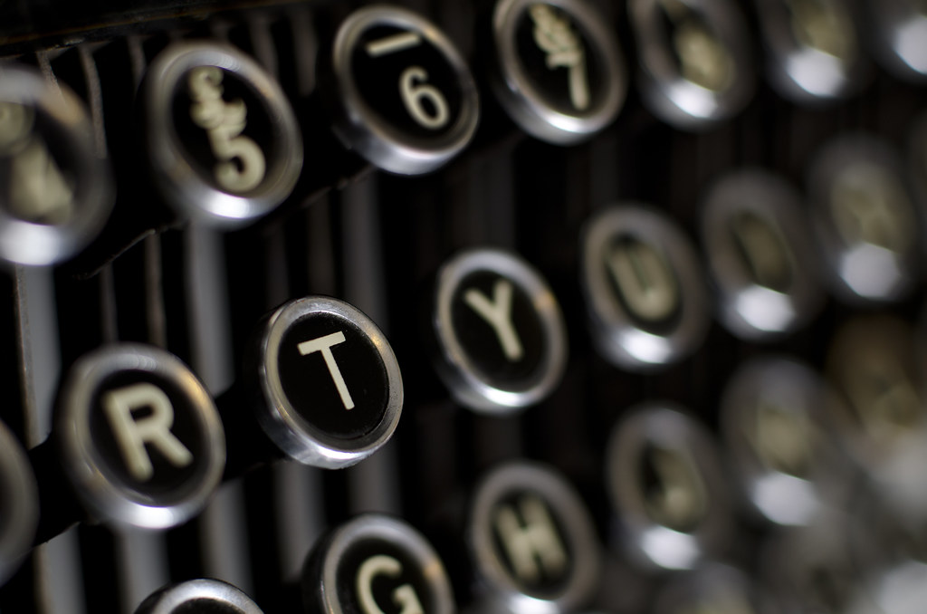
Thanks Allanlike this really well executed
Thanks MichaelHi Peter, nice picture. I like how the T is prominent, nice dof.

 & from me...made me giggle

Thanks for all the kind comments LynneHi Peter , finally manageing to catch up with everyone's threads , sorry for being so slack in commenting
Joy....what a great take on the theme & all images really well spotted & shot , no crit on this one....great work
Small...original & creative take on the theme & works really well , great focus , punchy colors...nice work mister
Love your reshoot for industry , great sky , lovely focus...love it
Straight....a big
Letter... right on theme , great DOF ...yup , works for me
Thanks Marsha. Good idea about the inclusion of the bottom layer of the keyboard.Hi Peter, lovely shot for letter, I think the DOF with the T sharp and the rest of the letters fading away looks great. I get a big fat fail for observation as I looked at both versions before reading DK's comments and hadn't spotted the difference:bonk:
I can't help thinking that the line of numbers at the top could be omitted to include the bottom line of letters, well that is assuming its a standard qwerty keyboard
Cheers GrampsAnother typewriter but the different end
Thanks RobertI really like this photo. Well executed.
Thanks for the comments Andy. I've afraid a burst of OCD took over when Dean noticed the upside down key. I just had to do a retake.Letter, cracking typewriter....
I really like the black and silver on such old objects. Something about the orientation that I'm not sure about...can't put my finger on it though.
I rather like the upside down 6.
Cheers.
Thanks for the kind words Iain. Luckily Sarah has been able to keep the typewriter rather than it spend the next x years sat in a cupboard doing nothing. It going to make a good prop.Not looked in for a while Peter, apologies.
Straight - a fun creative take on the theme, made me chuckle
This is one of those images which really works because it broke the "rules" in that the focus is on the mouth, the subject of the image. Some say focus on the eyes but this is definitely an exception to that, I really like this. Can't offer any crit as I think its spot on.
Letter - less is more here, your choice of focal point with such a narrow dof really works IMHO, the viewer knows exactly what this is, it needs no explanation. Lovely tones in here from the old typewriter, I am sure there is a lot more to be had by way of photographs from this.
Iain

Not spotted this one in a mag - although I'm a few issues behind the ones we get. Which one was it in?I think you're read the same magazine as me....maybe
I like it and especially that it isn't crisp. Well composed.
I'd like to see the blacks the same blackness and the shadow removed.
Often it's the case that the photographs that look as if they were easy to set up were the hardest!
However, I do like this one.
Cheers.
I'm undecided as to whether I like the rough edges, but then I think if it wasn't like that it would look too clinical and computer generatedThanks for the comments. Are the rough edges the ones in the glass. I think those will come down to the glass quality if so. Shame but as I said I not going to set it all up againVery clever Peter, I like it
I wouldn't even attempt something like this, I imagine too much swearing occurring!
Do you and Sarah sit each week and argue about who will do the most difficult shot? :-D

That is a very clever shot. Excellent.
Thanks Robert and Michael.Looks really good that does Peter. You have done really well, agree with Andy re the shadows and the blacks. I really like this.
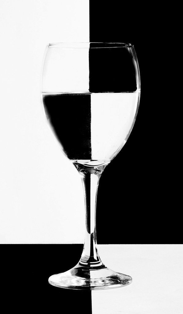
Thanks Michael. I knew a quick layer would do the job.Much better for me.
") Those cheap glasses have come in handy recently, is it my turn to use tem next week!! Our evenings have changed a lot since starting the 52!!
Those cheap glasses have come in handy recently, is it my turn to use tem next week!! Our evenings have changed a lot since starting the 52!!I'm afraid they were cheap Morrisons win glasses. That'll teach me :shake:I'm now sat in the dark looking at this and I can see what Andy said, the edited version is much better.
My comment about rough edges was about the areas in the glass, it's not so much rough but looks like colour contamination from the black into the white and vice versa, but looking again I like it as it is
I prefer the edit as well Peter, it reminds me of a sixties style dress!!
Marsha we don't argue over it, we discuss it and then do our own thing anyway!!
Letter - love it, really nice shot. Interesting angles, composition and DOF. Spot on.
Contrast - ooo another interesting one. Like what you have done, quite different take on the theme but spot on. Well done for what sounds to have been a tough shot to get
Really nice idea can't imagine how long that would have taken to set up etc the second one looks slightly crisper but no difference really on the black here on this monitor
Thanks for your comments Alex, Allan and BobI really like that typewriter shot, and the contrast/glass one is very clever.