superpippo
Suspended / Banned
- Messages
- 4,911
- Name
- Alan
- Edit My Images
- Yes
Hi Lynne
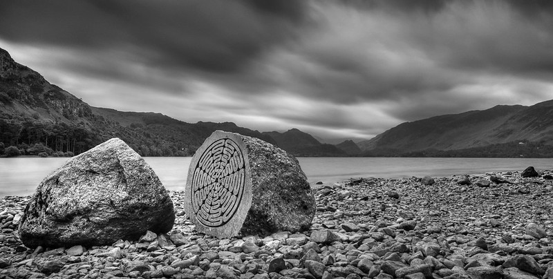
Below - as DK says, looks better on Flickr. Not sure what it is but lacks something - maybe a lower sun and a little off the top?. Comp is good tho with a nice diag from right leading into curve
Size - spot on that is worth a wall hanging. Beautiful colours and exc ellent focus. Can't find anything that I don't like about it.
Below - as DK says, looks better on Flickr. Not sure what it is but lacks something - maybe a lower sun and a little off the top?. Comp is good tho with a nice diag from right leading into curve
Size - spot on
that is worth a wall hanging. Beautiful colours and exc ellent focus. Can't find anything that I don't like about it.

") Glad you like the Size image...really pleased that it turned out just how I saw it in my minds eye
Glad you like the Size image...really pleased that it turned out just how I saw it in my minds eye 
")
 yup , Size actually came out as I envisaged it
 your size shot. All bases covered, spot on theme, lovely comp, excellent colours, well shot & presented:
 refer the b&W...i see movement in blades and in clouds across sky


 impressed that you can't see it