
You are using an out of date browser. It may not display this or other websites correctly.
You should upgrade or use an alternative browser.
You should upgrade or use an alternative browser.
weekly viv1969 (Ruth) 52 Challenge - SPIRAL Added
- Thread starter viv1969
- Start date
XenosElaine
Suspended / Banned
- Messages
- 1,458
- Name
- Elaine
- Edit My Images
- Yes
Spot on theme and a very pleasing colourful image 
 ...... good colour, focus and framing.
posiview
Suspended / Banned
- Messages
- 19,304
- Name
- Andy
- Edit My Images
- Yes
I like the colours, only 2 things I would change, the uneven spacing on the front row and the drop in the pipette, I would like to see it suspended before dropping into the dish. A great take on the theme.
Yup, I agree. Nice take on the theme and the lighting is well done.
Cheers.
blondie606
Suspended / Banned
- Messages
- 8,398
- Name
- Lynne
- Edit My Images
- Yes
Hi Viv....sorry I've fallen so behind with your thread 
Alphabet.....the flamingo feathers for me.....totally love it , super colors which are set off but the white framing, plenty of detail in the different feathers ....would have that framed large on the wall exactly as you have presented it here
Experiment...another that I love, really great idea , lovely pastel colors & well framed
Close -up......sorry to be boring but the Daffodil shot is another top shot for me , perfect yellow color & the swirly yellow( food coloring ?) sets it off a treat
Machine....think after your shots detailed above this is not quite on the same level.....plenty of detail & great lighting though")
Sound...love the ingenuity of the 2nd shot but the 1st gets my vote ,simple, a splash of color in the name plate & well framed")
I'll try not to leave it so long next time
Alphabet.....the flamingo feathers for me.....totally love it , super colors which are set off but the white framing, plenty of detail in the different feathers ....would have that framed large on the wall exactly as you have presented it here
Experiment...another that I love, really great idea , lovely pastel colors & well framed
Close -up......sorry to be boring but the Daffodil shot is another top shot for me , perfect yellow color & the swirly yellow( food coloring ?) sets it off a treat
Machine....think after your shots detailed above this is not quite on the same level.....plenty of detail & great lighting though
Sound...love the ingenuity of the 2nd shot but the 1st gets my vote ,simple, a splash of color in the name plate & well framed
I'll try not to leave it so long next time
OP
viv1969
Suspended / Banned
- Messages
- 29,452
- Name
- Bat-Frog
- Edit My Images
- No
I too have struggled and have yet to do something.
Like the different colour in the front dish.
Thanks Martin
The vinyl shot is a cracker, I love the way the light drops off towards the back of the frame, and that the darkness is broken up by the jack plug. A nice combination of different eras too.
Experiment, a solid literal take on the theme. Lovely colours and DOF works well. The only tiny fly in the ointment for me is the slightly uneven spacing between the petri dishes in the front row, but that's just a small personal thing.
Cheers Nick. I didn't notice the spacing. Driving me nuts now
Agreed on the vinyl shot. For me, it's the story of the two technologies that makes the image special. The thinking process can be seen clearly. It works really well.
Experiment, as Nick said, is a nice literal take on the theme. It that's a pipette hovering over the dish, then a blob of liquid about to drop off would make it really special. As it stands, it's still a great choice for the theme and technically would be excellent if I hadn't read Nicks comment about dish spacing. Grrr...
Thanks Ian. I just couldn't get the timing right for an impending drop....so I gave up

A difficult theme indeed, but that works well and I particularly like the different coloured liquid in the middle dish
Thanks Allan...Apreciate it
I prefer no. 2 for sound because there's more going on and you can see straight away that it's sound
experiment - at last, one that matches what's in my head lol - lovely shot, lots of colour
Thanks Summer. I thought lab equipment straight away, and since we have a bunch of it at work, I though, be rude not to
OP
viv1969
Suspended / Banned
- Messages
- 29,452
- Name
- Bat-Frog
- Edit My Images
- No
Hi Ruth - great idea and well put together.
Thanks Lorraine.
I'm hoping for something simple this week!
Phil Bennett
Suspended / Banned
- Messages
- 1,343
- Name
- Philip
- Edit My Images
- No
Excellent take on the theme Ruth.
Phil
Phil
OP
viv1969
Suspended / Banned
- Messages
- 29,452
- Name
- Bat-Frog
- Edit My Images
- No
Excellent take on the theme Ruth.
Phil
Thanks Phil.
I've noticed the BG is not as black as it might be....I shall have a tinker later.
sturisoma
Suspended / Banned
- Messages
- 2,908
- Name
- Summer
- Edit My Images
- Yes
Hi Ruth
the bg looks fine on my screen good take on the theme - just minor thing (and personal preference) but I would maybe have had the model wearing a shirt and jacket with maybe an expensive looking watch showing, just to make it look more gangster-ish (cos packing heat was a gangster term I think)
the bg looks fine on my screen
good take on the theme - just minor thing (and personal preference) but I would maybe have had the model wearing a shirt and jacket with maybe an expensive looking watch showing, just to make it look more gangster-ish (cos packing heat was a gangster term I think)
OP
viv1969
Suspended / Banned
- Messages
- 29,452
- Name
- Bat-Frog
- Edit My Images
- No
Hi Ruth
the bg looks fine on my screen
Getting him to get involved was hard enough.
A suit? Impossible!
OP
viv1969
Suspended / Banned
- Messages
- 29,452
- Name
- Bat-Frog
- Edit My Images
- No
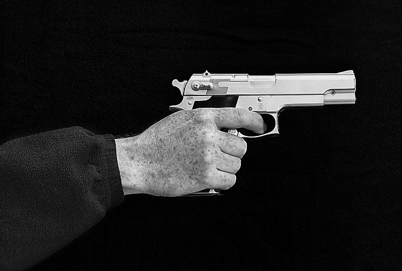
Interesting take ... but it seems to me that more space in font and less behind the gun might add something.
Thanks David
I did think about that, but thought that unless there was some indication of what the gun was pointing at, it might just be dead space.

Quicksnapper
Suspended / Banned
- Messages
- 704
- Name
- Sara
- Edit My Images
- Yes
Great interpretation and love the treatment of it against the black background.
69Bonni
Suspended / Banned
- Messages
- 2,480
- Name
- Steve
- Edit My Images
- Yes
Hi there Ruth... Trouble here...
Ah Experiment! I'll go for the black current jelly at the front please Ma'am! All the crit has been done so you've missed out on my incessant babble. Nice colours (pretty) and DOF. Don't forget to dish up the correct spacing on the reshoot .
.

Now I'm gett'n well worried about all dez women packing 9's init, first there's dat @Demm55 wiv a 9 and dat Big Bang. Now it's you wiv the Browning 9. It's getting a bit heavy on TP, now when I'm saying shoot, I ain't meaning pull da trigger got that? I'm meaning take the picture! Cool?
Like the sharp definition. Black background makes it really pop Fits the theme well in it?

Ah Experiment! I'll go for the black current jelly at the front please Ma'am! All the crit has been done so you've missed out on my incessant babble
. Nice colours (pretty) and DOF. Don't forget to dish up the correct spacing on the reshoot.Mega groan!Thanks David
I did think about that, but thought that unless there was some indication of what the gun was pointing at, it might just be dead space.
Now I'm gett'n well worried about all dez women packing 9's init, first there's dat @Demm55 wiv a 9 and dat Big Bang. Now it's you wiv the Browning 9. It's getting a bit heavy on TP, now when I'm saying shoot, I ain't meaning pull da trigger got that? I'm meaning take the picture! Cool?
Like the sharp definition. Black background makes it really pop
Fits the theme well in it?brownin
Suspended / Banned
- Messages
- 907
- Name
- nathan
- Edit My Images
- Yes
Hi Ruth,
As usual your images are bang on theme,
Machine: sorry ruth not fussed on this one, it meets the theme but I can't find interest in it.
Alphabet shot; I love it, its sharp, and it's vibrance and colour is certainly eye catching and definitely on theme.
Sound; I prefer the second one with the earbuds, nice and sharp and well lit, my only bug bear would be the jack sort of levitating in the corner, I would personally have preferred the jack laying down and the cable looped or something similar but that just preference.
Experiment; pastel coloured liquid substance, tweezers and petri dishes how much more on theme can you be.. great shot
Heat; different take on theme and certainly original, did you add the grainy effect or is it just my eyes.
Raptor Mike
Suspended / Banned
- Messages
- 2,812
- Name
- Mike
- Edit My Images
- Yes
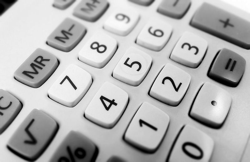
It still works though Ruth. Nice use of dof and it looks good as a mono. But it reminds me of a question... Why is it that calculator numbers start at the bottom, but phone numbers start at the top 
XenosElaine
Suspended / Banned
- Messages
- 1,458
- Name
- Elaine
- Edit My Images
- Yes
Heat - a very original interpretation, well composed and just enough space either side for my liking My only crit would be that although the hand looks spot on, somehow the gun looks a bit flat to me - almost like a cardboard cut-out - but that's probably just me
My only crit would be that although the hand looks spot on, somehow the gun looks a bit flat to me - almost like a cardboard cut-out - but that's probably just me - Messages
- 11,169
- Name
- Tim
- Edit My Images
- Yes
Heat: I was thinking along those lines as my backup shot, though mine would have been a nerf gun.
I think it works well against the black background. I thought the same as Elaine, that the gun looks a little 2D. Lack of shadows on it perhaps?
Figures: I love the shot, it's not "lost mojo", It's something you could possibly sell on as the background for an advert (I'm thinking insurance company / bank / something financial). Nice use of mono and large apertures
OP
viv1969
Suspended / Banned
- Messages
- 29,452
- Name
- Bat-Frog
- Edit My Images
- No
Nice gun
On iPad so can't see any issues with the BG. Nice detail. I might have cropped in a little closer, I did so and seemed to have more impact.
Cheers and don't bring it to the Mega Meet
Great interpretation and love the treatment of it against the black background.
Nice take on the theme, I kind of agree with d00d about the placement in the frame nothing wrong with a little dead space,
When I saw this it made me LOL so for a Plan C it is inspired IMHO
Hi there Ruth... Trouble here...
Ah Experiment! I'll go for the black current jelly at the front please Ma'am! All the crit has been done so you've missed out on my incessant babble
Mega groan!
Now I'm gett'n well worried about all dez women packing 9's init, first there's dat @Demm55 wiv a 9 and dat Big Bang. Now it's you wiv the Browning 9. It's getting a bit heavy on TP, now when I'm saying shoot, I ain't meaning pull da trigger got that? I'm meaning take the picture! Cool?
Like the sharp definition. Black background makes it really pop
Steve, it's a Smith 645
Hi Ruth,
As usual your images are bang on theme,
Machine: sorry ruth not fussed on this one, it meets the theme but I can't find interest in it.
Alphabet shot; I love it, its sharp, and it's vibrance and colour is certainly eye catching and definitely on theme.
Sound; I prefer the second one with the earbuds, nice and sharp and well lit, my only bug bear would be the jack sort of levitating in the corner, I would personally have preferred the jack laying down and the cable looped or something similar but that just preference.
Experiment; pastel coloured liquid substance, tweezers and petri dishes how much more on theme can you be.. great shot
Heat; different take on theme and certainly original, did you add the grainy effect or is it just my eyes.
Thanks all for your continued comments
OP
viv1969
Suspended / Banned
- Messages
- 29,452
- Name
- Bat-Frog
- Edit My Images
- No
It still works though Ruth. Nice use of dof and it looks good as a mono. But it reminds me of a question... Why is it that calculator numbers start at the bottom, but phone numbers start at the top
misplaced mojo!!
I think it's a good idea but think it would work better showing figures on the screen.
Heat - a very original interpretation, well composed and just enough space either side for my liking
Nothing wrong with your Figures placeholder shot. You actually got a complete set of figures there!
Heat: I was thinking along those lines as my backup shot, though mine would have been a nerf gun.
I think it works well against the black background. I thought the same as Elaine, that the gun looks a little 2D. Lack of shadows on it perhaps?
Figures: I love the shot, it's not "lost mojo", It's something you could possibly sell on as the background for an advert (I'm thinking insurance company / bank / something financial). Nice use of mono and large apertures
And again folks...I really do appreciate you keep coming and taking a look.
I'm hoping my efforts improve!
I'm going to make the effort and catch up on everyone else's threads, I promise!
blondie606
Suspended / Banned
- Messages
- 8,398
- Name
- Lynne
- Edit My Images
- Yes
Hi Ruth
heat....love it ( though I find it a tad worrying that you have a gun ) , original take on the theme , well lit-no annoying highlights anywhere I reckon just a smidge more sace in front & a little less of the arm though.....Quite like Summer's idea as well , suit & flash watch would def give it a more 007 feel
 ")
Figures....I think my mojo may be with your's....can you tell mine to come home when you find your's please
heat....love it ( though I find it a tad worrying that you have a gun
) , original take on the theme , well lit-no annoying highlights anywhere I reckon just a smidge more sace in front & a little less of the arm though.....Quite like Summer's idea as well , suit & flash watch would def give it a more 007 feel Figures....I think my mojo may be with your's....can you tell mine to come home when you find your's please
69Bonni
Suspended / Banned
- Messages
- 2,480
- Name
- Steve
- Edit My Images
- Yes
Placeholder looks ok to me .... Looked around the workshop for your Mojo I haven't got it
Nice DOF and sharp focus fits the theme what's to worry about
Uuummmm Smith 645 big guns eh! Nearly 12 mil round makes a Big Bang and a big hole
Nice DOF and sharp focus fits the theme what's to worry about
Uuummmm Smith 645 big guns eh! Nearly 12 mil round makes a Big Bang and a big hole
Dark Knight
Suspended / Banned
- Messages
- 13,393
- Edit My Images
- Yes
Hi Ruth
Sound - Tough choice this, I'm liking the first one due to the simpleness and symmetry but the 2nd does it for me, liking the combination of elements and the placement of them, cool lighting too
Experiment - Workplace props... now I am intrigued
Nice idea with just the one purple dish, liking the edge of the surface and black background strip, really helps lift the colours for me
Heat - Love this, what a cracking idea... the B&W works really well, not another workplace prop I hope :nailbiting:
Figures - Again a spot on subject for the theme, liking the angle you have used and the shallow DoF
OP
viv1969
Suspended / Banned
- Messages
- 29,452
- Name
- Bat-Frog
- Edit My Images
- No
Hi Ruth
heat....love it ( though I find it a tad worrying that you have a gun
Figures....I think my mojo may be with your's....can you tell mine to come home when you find your's please
Thanks Lynne
I'd help, but my MOJO is still AWOL. I've got absolutely nothing this week so far
Hi Ruth,
Figures - I wouldn't worry about your mojo, it was a really tough theme, and even for a placeholder your shot fits the bill nicely
Thanks Lorraine....appreciate that.
Placeholder looks ok to me .... Looked around the workshop for your Mojo I haven't got it
Nice DOF and sharp focus fits the theme what's to worry about
Uuummmm Smith 645 big guns eh! Nearly 12 mil round makes a Big Bang and a big hole
If I find out you're deliberately hiding said mojo, well let's just say there'll be trouble fella

Hi Ruth, it doesn't look like a lost mojo shot to me, I like it. it fits yet another difficult theme perfectly, so well done to you
I havent even done one yet
Thanks Susie. I'm still struggling this week too. Got nothing so far
Hi Ruth
Sound - Tough choice this, I'm liking the first one due to the simpleness and symmetry but the 2nd does it for me, liking the combination of elements and the placement of them, cool lighting too
Experiment - Workplace props... now I am intrigued
Nice idea with just the one purple dish, liking the edge of the surface and black background strip, really helps lift the colours for me
Heat - Love this, what a cracking idea... the B&W works really well, not another workplace prop I hope :nailbiting:
Figures - Again a spot on subject for the theme, liking the angle you have used and the shallow DoF
Huge thanks for the catch up comments DK....deeply appreciated
Manxmaid
Suspended / Banned
- Messages
- 5,381
- Name
- Andrea
- Edit My Images
- Yes
Hi Ruth, I just realised I never did get here to your thread after you took the time to go through mine and leave loads of feedback, so I'm sorry about that and here I am
I've really enjoyed looking through your images, although there are a few broken links so I'm not sure I've seen all of them but I've picked out a few favourites:
Fragile - lovely delicate subject matter and super shadow contrasting well with the strong red of the fruit
Watery - a really clever and eye-catching shot with great colours and background
Vertical - this is something I haven't tried yet and yours makes me want to! A lovely range of colours against the good black background
Mouth - definitely a Marmite shot and very weird, but great idea and processing!
Alphabet - eye-catching jumble of shapes and colours and great for the theme, and I also like the colours and textures in the Flamingo triptych
Experiment - I would never guess you struggled with this one as it's spot on; a very clean image, well composed and exposed and bang on theme
I see you've lost your mojo at the moment but I hope you find it again soon as your thread has been great to look through and I look forward to seeing more