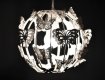
I think the crop's a little too tight as you've lost too much of the black background that made it stand out so well. I'd have just taken a slither off the right hand side and left it at that. But then this is all a matter of opinion, as you'll gather gather from Carl's completely opposite comment above. Off-centre works too but if I was going for that I'd shave a little off the left instead to make sure it's clear that the shade is deliberately off centre.
Don't worry about aspect ratios, go with what's best for your image. Even if you wanted to print them out, each different standard size has a diferent aspect ratio anyway.

")


 But thanks again for taking the time to comment!
 Tp altered
") And thank you for the compliment!
And thank you for the compliment!


 I think its an excellent shot, the focus gives it a dream like quality.