Printing Problem.

kernowbhoy

Suspended / Banned
Messages
544
Name
Andy
Edit My Images
Yes
I have recently sent some B&W shots to a well known printer and prints were very dark. I tried another printer with the same result.
I have used the computer onboard directions for correct brightness, contrast, etc. and it all looks good.
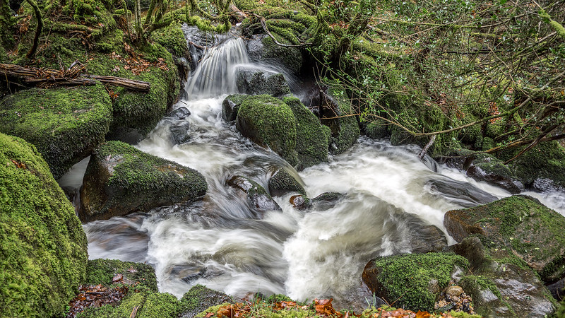
This is how it looks on the computer screen
2466 by Andy Martin, on Flickr
And this is how dark the print is
2466-Edit by Andy Martin, on Flickr
Any advice to where I'm going wrong as both printers gave the same result ?
 
Maybe use an external calibrator rather than relying on the monitors in built software....
 

Andy, your problem comes from the non-awareness of a common
situation. As your display is a constant additive light source, a print
is the opposite. The light source is hardly the same and the medium
is a subtractive one; the consequence is the darker print.


If you have been working in the dark room, remember that you may
have exposed some test strips to figure out the proper exposure of
the final print.

This time, create a digital test strip jpg that will show the chosen ren-
dition in say 4 or 8 increments of +1/3 EV, have it print and you will
know how much correction you need to include to get to the desired
final rendition. This correction may be included in a publishing profile.
 
Last edited:
So what's your display brightness set to? Assuming that you haven't got a measuring device, what's the % in the on-screen display adjustments? If it's over 50%, that's your trouble.
 
Last edited:
It's normally your brightness is too high on your monitor.
 
I'm no expert with this but when sending to print/(printers) I adjust the brightness and up it around 20 clicks or so.

One thing I learned recently is a dark photograph is not great for printing and printing companies will struggle. As hinted at above, we tend to have our monitors on the bright side and it's best to compensate for printing.
 
Put simply, if a print is too dark you have your monitor too bright!

You have said you used "computer onboard directions for correct brightness....." etc. Did these directions tell you this was to achieve correctly processed image files for printing? If not why and how could you be sure that the prints would match what you see on screen?

Brightness of the screen as seen, set and perceived by eye based on "computer director ed settings" can be hit & miss.

To be a absolutely sure you need to take control by either a series of test strip prints as mentioned by Kodiak or get a calibrator and as part of that process set the screen brightness to suit your ambient conditions. For example in my case in very subdued light my screen I'd set to 100cd/m2

There are a good few threads herabouts dealing with the repeated questions "why are my prints so dark compared to my screen...."

HTH :)
 
I'm no expert with this but when sending to print/(printers) I adjust the brightness and up it around 20 clicks or so.

Can you qualify that part of what you say.......just where and in/on what are you adding 20 clicks?

If printing you need to have control of the whole process from image ingestion to print output, adjusting on the fly cannot cover or compensate for every variation of exposure 'situations'.
 
Your problem is probably that the image is in ProPhoto RGB. The color space is embedded correctly so my guess is the shop you used doesn't support ProPhoto.
The brightness is fine. I get a bit of OOGamut warnings for the blacks with a couple of paper/printer profiles, but nothing to suggest it should print like that.
 
Last edited:
Can you qualify that part of what you say.......just where and in/on what are you adding 20 clicks?

If printing you need to have control of the whole process from image ingestion to print output, adjusting on the fly cannot cover or compensate for every variation of exposure 'situations'.
Usually in Photoshop (but occasionally in Lightroom where I adjust exposure instead). It's a cheap, cheat but I use the Brightness/Contrast tool and simply alter Brightness up from 10+ to around 25 or so. The darker the image the higher the number. I do admit, it's a guessing game but the two or three companies I use are pretty good and produce images I like. (DSCL and Loxley)
 
Your problem is probably that the image is in ProPhoto RGB.
The brightness is fine. I get a bit of OOGamut warnings for the blacks with a couple of paper/printer profiles, but nothing to suggest it should print like that.

On my phone so did not bring the image into a process programme............. so as you say the devil may be in the details but where such mismatch of embedded profile (outputted mismatched to printer/printing) has been discussed, such dark print have not been so pronounced.
 
Usually in Photoshop (but occasionally in Lightroom where I adjust exposure instead). It's a cheap, cheat but I use the Brightness/Contrast tool and simply alter Brightness up from 10+ to around 25 or so. The darker the image the higher the number. I do admit, it's a guessing game but the two or three companies I use are pretty good and produce images I like. (DSCL and Loxley)

And what does your histogram look like before and after that sort of adjustment........I feel Kodiak might come along to raise the question of DRL setting.
 
but where such mismatch of embedded profile (outputted mismatched to printer/printing) has been discussed, such dark print have not been so pronounced.
Agree it seems a bit extreme... but combine color space mismatch w/ a narrow gamut paper and I think it's possible/probable. Since I'm fully calibrated and it looks OK to me, I can't come up w/ another cause...
 
Until Andy comes back with a more detailed explanation of what his setup is and workflow was/is, all is conjecture!
 
I'm no expert with this but when sending to print/(printers) I adjust the brightness and up it around 20 clicks or so.

One thing I learned recently is a dark photograph is not great for printing and printing companies will struggle. As hinted at above, we tend to have our monitors on the bright side and it's best to compensate for printing.
It would be better to get control over your ambient lighting and adjust your monitor brightness "correctly."
 
To do it right and get consistent results you need to calibrate your monitor. In the process of doing this you will set the brightness of the monitor 'correctly' for the ambient light you work in. In my case I have a dim room so the setting is between 85-100cd/m2, because in a dim room your monitor looks brighter than in a lighter room hence you need a lower brightness.

You need to match up the printed image to the screen image by comparing the print with what you see on the monitor. If its darker you change the brightness/contrast of the print (NOT the monitor) in the print settings. EG in LR there is a brightness/contrast setting in the Print Job module that is used to compensate for this. Note: you need to look at your prints in the ambient light you expect them to be viewed when doing this comparison, e.g. don't expect a print in a dim room to match a monitor. This bit is a bit of trial and error and is entirely subjective but you can match them up eventually.

Thats how I setup my environment and it produces consistent prints that are comparable to what I see on screen and in my target ambient light.

If you have the monitor brightness set and calibrated at a level to suit the ambient lighting then however you process that image that is how the print should look.

If still too dark (or too light) then possibly what I say above is not close enough in "balance" and that will need tweaking!
 
Thanks for all the advice ! I have checked that I am now using adobeRGB on my camera and through the processing. Sk66 was right that it was on prophotoRGB in lightroom.
I did wonder about how bright my screen is, but as Box Brownie just mentioned I couldn't see the screen brightness affecting the histogram which for the shot in question was just fine.
I tried processing the raw image again using nothing but the ''auto'' choices and the result was pretty much the same. My screen brightness level is 50% as advised.
I have found a local printer and will take some shots on a memory stick and see what he thinks.
Thanks again for all the ideas.
 
As you are using raw it matters not what colour space the camera is set to......for print purposes it is the embedded colour space which for many printers will be sRGB unless the printing lab tell you otherwise.

Without re reading the whole thread I cannot recall 50% brightness setting being mentioned as best for you (?) especially as in isolation that is arbitrary depending on how bright the room lighting is when it comes to preparing I images for print.

As I said I process in a very dimly lit room and my brightness on a 100cd/m2 calibrated monitor is set at 25% if I recall when I was trying it at 80cd/m2 this brightness was something like 10%

Therefore apart from the potential impact still of using this wring output embedded profile, your monitor may still be too bright.........even with identical make & model of monitor with both set @ 50% brightness they when "measured" are likely different in cd/m2 terms.
 
As Box said ... the brightness of my monitors is about 15% on its scale and it is important you get that right if you want the images to match.

Try reducing the brightness of your monitor and reprocess the image but then look at the image under the lighting you would expect to look at it. EG under a cloudy sky, a normally light room. Then compare it to the screen version.
 
Thanks for all the advice ! I have checked that I am now using adobeRGB on my camera and through the processing. Sk66 was right that it was on prophotoRGB in lightroom.
Does the print shop support AdobeRGB? I kind of doubt it since it had an issue w/ ProPhoto. You're safest bet is to export the file from LR as sRGB...
 
Thanks again for all the advice and information.
How does this shot appear to you all on your own screens ? Too dark, too bright, colour ?
 
Blocked-up at the black & white ends but I'd say that the mid-tones are fine - ie that the general balance is right.
 
Actually it's not, a B&W image is typically still an RGB image... It's "B&W" because the RGB levels are the same at every point, but they're still RGB.
Obviously, but from his posted examples (the second of them currently missing), the author was talking about a radical case of tonal difference, which implies more to me than just a case of gamut. First things first.
 
Obviously, but from his posted examples (the second of them currently missing), the author was talking about a radical case of tonal difference, which implies more to me than just a case of gamut. First things first.
If it were screen brightness the original should look dark on my monitor. Being that my setup/browser is fully color managed and can interpret ProPhoto correctly, it looks fine here to me.
 
Looks slightly bright and a bit too much clarity for me. Otherwise I would say that is visibly ok.
 
If it were screen brightness the original should look dark on my monitor. Being that my setup/browser is fully color managed and can interpret ProPhoto correctly, it looks fine here to me.
There were TWO originals .... you're out of sync with my remark.
 
Two? One was the original and was a representation of how it printed... So, only one "original" as to how it looks/looked on screen.
Ok, I see your point ... whoops, sorry, Steven. But I'm still finding it hard to accept that it could be a colour gamut issue. But then I've never had this problem.
 
This is why some labs offer manual colour and density correction.
 
To conclude I took some shots to a local printer and with the minimum, in some cases no adjustment at all, I have A3 size prints that look great ! So from now on I shall be printing this way !
Thanks for all the input from everyone.
 
Back
Top