weekly Michael23's 2012 52 COMPLETED! WooHoo! Slide show added

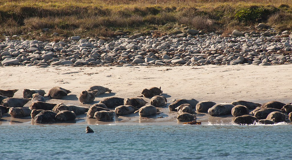
I like your idea about them being spread out. I always like seeing seals like this. They seem to be sat there watching the world go by.

Thanks Peter, it was very comical watching them. We were on a glass bottom boat and some swam underneath us :thumbs:

great idea, I'd like to see a wider crop tho - maybe just at the top. :) you should post the larger one too anyway :p

Thanks Summer, I did crop this as there were some other seals above that were not fully in view. I will have a look at the other pics and see what I have got
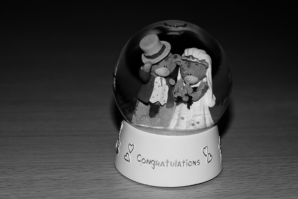
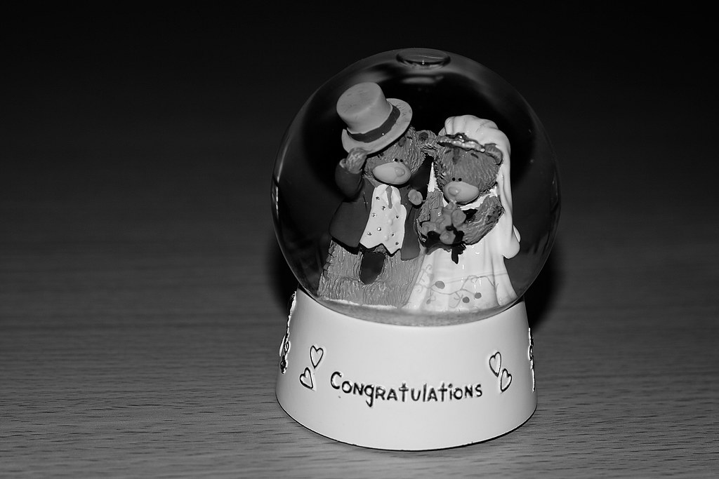
 :thumbs:
 
Hi, Michael, really liking the 3 photographs in post 910. All have a great aged, film feel to them.

Spread, what's not to like about seals...they always seem to have a chilling feel to them. Doesn't scream spread to me because they're all quite close together. Appreciate the lighting prevented a wider composition :thumbs:

Cheers.
 
ah now see I like that - I would maybe crop the grass out and straighten the water line, but I do like it :clap:
 
Two crackers for spread there Michael :thumbs:

#2 says spread more than #1 but I really like both.
#1 really tells a story of a close knit group doing a bit of "loafing" :lol:
#2 I particularly like the layers going on within the frame. The grass, the rocks, the sand, the seals through to the water is a very pleasant composition IMHO.
I can see how it would be problematic exposure wise but you've handled it well. Great work Iain
 
Hi Michael

Change - like the comp and colour in this. Ticket is creative, giving the context in which the change has been given.

Natural - good moody feel and all elements: clouds, rain, coast, churning sea contribute to the theme. Agree with Lynne that the horizon looks a bit tilted.

Age - just a little hard to match to the theme imo but what a cracking shot and treatment. Putting the subject aside the treatment is itself redolent of age with the soft colours, the vignette. I have shots of my parents in the 50s/60s which have this patina of age. :thumbs:

Spread - another good idea. Hard to choose as #1 has more detail and isolation of the seals against the rocks. On theme for me.

#2 (crop) is also on theme and well handled imv. I get a kind of humourous feel as the group of seals look as immobile as the group of rocks and have a similar outline. For the theme I would prob choose this one.
 
Hi Alan, thanks for popping by, I keep looking at the natural photo, I can't make my mind up if it's straight or not lol. It was taken whilst on a boat, so could very easily be out!

Age, I certainly wished I had a bit more time with it, I still really like it and as you say the pp really does give it an aged look. Instagram is a handy app sometimes!

I like them both to for spread, but I may well go the crop of number 2.
 
Hi Michael....hope you had good fun on your jollies :thumbs:

Spread...ya got me at the mention of seals , they are just such cute & comical creatures....after looking lots at the 3 images I'll have to plump for #1 for no other reason than it's close up & their expressions are great :thumbs:
 
nicely lit must have been hard with the glass to get a clear image
 
the lighting looks good Michael, it looks like the flash was in line with the camera... the shadow to the rear, but it works ;).. I like the bubble at the top, that for some reason, fits right in with the rest. It fits the theme really well. Mono suits perfectly.

I'm not sure on the textured top it's resting on... I'm not sure having the grain running left to right suits, for my tastes anyway :D... and I can't work out, whether the congratulations has just slipped out of the DOF or is getting a bit too much light, possibly a little of both, and I'm finding I'm drawn to it...

Congratulations to the both of you :thumbs:


I find that I am in complete agreement with these comments:plusone:
 
Hi Michael, sorry I'm a bit behind here!

Change, I like the composition and the pp. My only crit is the last two letters of the ticket have been lost in the shadow.

Natural, I like that, the pp gives it a nice dramatic edge :thumbs: is my OCD playing tricks on me or is the horizon leaning a little?

Spread, nice seals on the rocks. I think it fits the theme as they're spread out on the rocks not necessarily spread apart from each other:thumbs:
 
nicely lit must have been hard with the glass to get a clear image

Was quite tricky, most awkward being the reflections from the flash.

the lighting looks good Michael, it looks like the flash was in line with the camera... the shadow to the rear, but it works ;).. I like the bubble at the top, that for some reason, fits right in with the rest. It fits the theme really well. Mono suits perfectly.

I'm not sure on the textured top it's resting on... I'm not sure having the grain running left to right suits, for my tastes anyway :D... and I can't work out, whether the congratulations has just slipped out of the DOF or is getting a bit too much light, possibly a little of both, and I'm finding I'm drawn to it...

Congratulations to the both of you :thumbs:

I find that I am in complete agreement with these comments:plusone:

You made a good point there, John. Had a revisit in pp, it looks like it was a a mix of both light and processing. I attempted a re-edit and got one I like, it all worked, apart from a flash reflection, I couldn't clone it out very well compared with the first edit, but the text was better. So I loaded the above photo in elements and selected the move tool to drag and drop on top of the other image I had just pp'd and then I used the eraser over the text only to bring that through and merged the layers and voila! After a bit of fiddeling, please see the result below :thumbs:

Hi Michael, sorry I'm a bit behind here!

Change, I like the composition and the pp. My only crit is the last two letters of the ticket have been lost in the shadow.

Natural, I like that, the pp gives it a nice dramatic edge :thumbs: is my OCD playing tricks on me or is the horizon leaning a little?

Spread, nice seals on the rocks. I think it fits the theme as they're spread out on the rocks not necessarily spread apart from each other:thumbs:

I like together but agree with previous comments, the middle of the word congratulations isn't quite right.

I hope you enjoyed your holiday?

Thanks Marsha, I did notice that on the change shot, but I decided just to go with what I had as I really liked it as it was. Natural, I'm not sure I think it is natural as the sea lies, perhaps a bit of an optical illusion going on in the pic.
Together, edit below.
Holiday was super! A real mixed bag of weather, loved every minute of it! As did Fluffy and Co!


Together V2 by scilly puffin, on Flickr
 
Yep, that's much better Michael :thumbs:, being really really picky, the 't' still doesn't quite look right... but... I doubt I'd have spotted it had I not been looking for it ;)... therefore... not a problem :D
 
Nice one Michael. Congrats on the 6 years but you have a few more to go to catch up on myself and Sarah (20 years this year). :) Photo wise I feel the lighting has been well handled and I particularly like the light foreground to dark background that you've used.
 
Hi, there, Together, gotta smile when I see these.

Well lit and composed. Feels like it's leaning right to me :thinking:

Could be me, though.

Cheers.
 
Hi Michael

congrats to you & your good lady.....me thinks you're quite the romantic :clap:

Liking the last edit , you've done wayyyy better than I could have with the lighting....nice work mister :thumbs:

ps....I really wanna see this in color with some sort of dreamy soft BG...just to be awkward :)
 
Right, was beginning to think I was going to fall behind even further! I have just not been able to think of anything for the latest 2 themes, just a complete blank space. Very frustrating indeed :bonk:

I just have to much to do, only 4 weeks till baby is due, we keep double checking if we have everything :lol: So maybe I have been a bit distracted :lol:

Onto pack, quite like this one, only thing annoying me is the base of the pack of nappies I couldn't get it neat,


Week 45, Pack by scilly puffin, on Flickr

And art, this has survived being sat in a box in the loft for the last 4 years or so!
Wasn't sure how to photograph it, so I held it up to the patio door with the light coming in from the back. I also used the built in flash and gave it a bit of pp in elements.


Week 46, Art by scilly puffin, on Flickr

So, I am up to date. Will get around your threads as soon as I can. :thumbs:
 
well done for getting up to date is the artwork one of yours ;)
 
Pack - Spot on theme and you seem to have lit the subject well. Blimey 4 weeks to due date! Here's hoping for a good theme in the last couple of weeks to get a baby shot into your 52.

Art - I think the cracks add to this as do the boxy houses :lol:
 
Thanks Peter, it's gone mega fast, I have somehow committed myself to a 365 of our little boy growing up, hopefully I can get one in my 52.

Art, it worked quite well didn't it, even if I do say so myself...lol
 
Dam it lost my post:bonk:

Pack, nice pp loses the bright colours on the packaging. Not sure on the dark background though, maybe a lighter shot in a baby room environment would be a little softer:thinking:

Art, perfect for the theme, lovely colours, could you use it again this week :naughty:
 
Back
Top