
You are using an out of date browser. It may not display this or other websites correctly.
You should upgrade or use an alternative browser.
You should upgrade or use an alternative browser.
weekly Michael23's 2012 52 COMPLETED! WooHoo! Slide show added
- Thread starter LauraJ23
- Start date
- Messages
- 1,873
- Name
- Sarah
- Edit My Images
- Yes
Hi Michael, a nice simple shot - good use of DOF and suits the B&W conversion!")
I have used a small LED torch for most of the lighting for mine this year, I've learnt alot about lighting this way - it helps you to see the effect instantly!
I have used a small LED torch for most of the lighting for mine this year, I've learnt alot about lighting this way - it helps you to see the effect instantly!
Last edited:
OP
LauraJ23
Suspended / Banned
- Messages
- 14,759
- Name
- Laura
- Edit My Images
- No
Hi Michael, a nice simple shot - good use of DOF and suits the B&W conversion!
I have used a small LED torch for most of the lighting for mine this year, I've learnt alot about lighting this way - it helps you to see the effect instantly!
Hiya Sarah, thanks for popping by, pleased you like it. I have done a few pics with light painting in the past, it is certainly fun. I was going to do light painting on this one, but couldn't find the torch!
Hi Mike, pleased you like it, took quite a few goes to get it right, I kept noticing I had misplaced the top coin on the second row. Certainly makes you very thorough this projectMoney - now that I like a lot.
Very abstract - super shot and very well suited to B&W
Mike

I wonder what week 10 will bring!
zeb
Suspended / Banned
- Messages
- 1,139
- Name
- Trevor
- Edit My Images
- Yes
This is a great shot Michael I think nearly everything works,
2 picky things
1: the end stack looks bigger than the other 3,
2: would like to see a bit better angle so as you can see the top a bit more and see that they are coins if you get my drift.
2 picky things
1: the end stack looks bigger than the other 3,
2: would like to see a bit better angle so as you can see the top a bit more and see that they are coins if you get my drift.
ChickenDipa
Suspended / Banned
- Messages
- 1,513
- Name
- Alex
- Edit My Images
- Yes
Handmade - #2 for me, lovely colours and the textures show up really well.
Money - very interesting, I cant help but like it. Great DOF. Well and truly meets the theme!
Money - very interesting, I cant help but like it. Great DOF. Well and truly meets the theme!
OP
LauraJ23
Suspended / Banned
- Messages
- 14,759
- Name
- Laura
- Edit My Images
- No
Money
Great shot, love the DoF you have managed to get....... here it comes the BUT
I doesnt shot out money to me, i think it would have been better at a slightly higher angle where you could see the top of the coin.
Hi Darren, thanks for the comment, will consider the higher angle for the next time,
This is a great shot Michael I think nearly everything works,
2 picky things
1: the end stack looks bigger than the other 3,
2: would like to see a bit better angle so as you can see the top a bit more and see that they are coins if you get my drift.
Hi Trevor, looks like a bit of lens distortion creeping in there. Thanks for your thoughts
very nice, DoF does it for me
Hiya Summer, pleased you like it
Handmade - #2 for me, lovely colours and the textures show up really well.
Money - very interesting, I cant help but like it. Great DOF. Well and truly meets the theme!
Hiya Alex, glad you like the pics, really liked my handmade shots and thhe coins worked out very well.
Delta Skies
Suspended / Banned
- Messages
- 6,502
- Name
- Peter
- Edit My Images
- Yes
Good use of DoF on your money shot
jeangenie
Suspended / Banned
- Messages
- 3,953
- Name
- Jean
- Edit My Images
- Yes
Money: Well done - simple, but effective interpretation of the theme. I like the b&w conversion and the dof very much. I actually think the lighting looks fine, and my only niggle would be I think the in-focus stack would look great on the third - it's a bit close to the edge. Well done on another good week.
A couple of people are commenting on how this year seems harder than last and I found that in 2010, after doing 2009. That's why I had a year off - this year doesn't seems to have got into its stride yet, but I'm sure it will.
Jean
A couple of people are commenting on how this year seems harder than last and I found that in 2010, after doing 2009. That's why I had a year off - this year doesn't seems to have got into its stride yet, but I'm sure it will.
Jean
OP
LauraJ23
Suspended / Banned
- Messages
- 14,759
- Name
- Laura
- Edit My Images
- No
Simple and effective... good use of DOF. I think it works nicely in mono
Hi John, thanks for your comments, pleased you like it.
Great shot for money, my only little comment is I would have liked the first stack to be a little lower because the others are in ascending order, although it's only a minor thing
Otherwise on the money
Thanks Harry, I see what you mean, I hadn't actually noticed the front stack looking slightly bigger, will certainly remember that in future shots.
Money: Well done - simple, but effective interpretation of the theme. I like the b&w conversion and the dof very much. I actually think the lighting looks fine, and my only niggle would be I think the in-focus stack would look great on the third - it's a bit close to the edge. Well done on another good week.
A couple of people are commenting on how this year seems harder than last and I found that in 2010, after doing 2009. That's why I had a year off - this year doesn't seems to have got into its stride yet, but I'm sure it will.
Jean
Hiya Jean, thanks for your thoughts, taken in for the future. Indeed doing this a 2nd yr running is very challenging, but I couldn't imagine not doing it
 I reckon this will get into the stride at the halfway point, something very similar to last year.
Michael that money shot, is well bang on the money
Hi Liz, thanks for your comments, much appreciated and pleased you like the pic.
Money - On theme of course, B&W works well, the only niggle for me is focus appears to be a little out (slightly infront of the first stack) but that's me being picky.
Hiya Nathalie, thanks for your thoughts. There was not a lot of dof to play with, I spent ages trying to nail the focus, this was the best I got. I need a proper macro lens!
Nathalie
Suspended / Banned
- Messages
- 531
- Edit My Images
- No
Buy one!I need a proper macro lens!
") It changes the way you look at the world around you. My 60mm micro was the first lens I bought (apart from the kit lens, but that doesn't really count) and I use it all the time.
It changes the way you look at the world around you. My 60mm micro was the first lens I bought (apart from the kit lens, but that doesn't really count) and I use it all the time.
OP
LauraJ23
Suspended / Banned
- Messages
- 14,759
- Name
- Laura
- Edit My Images
- No
Its on my list! But having just won the battle against saving money, I have brought a 50-500 sigma from focus today! I do have a macro lens with all of my manual film kit, I think I might try an adapter and see if it does a good job
blondie606
Suspended / Banned
- Messages
- 8,398
- Name
- Lynne
- Edit My Images
- Yes
HI Michael
you should do ok with the 500-500...monster of a lens...with IS ? I bought one a while back but couldn't get on with-it due to no IS so traded it for 150-500 is SIGMA & love it
Money.....good DOF ,B&W works well ,the flash light is symetrical on the stacks so doesn't bother me....1 less coin on the 1st stack & possibly a slightly higher POV to see the top of the coins ? Still , good work mister
Go on , treat yourself to a macro lens...you know it makes sense
OP
LauraJ23
Suspended / Banned
- Messages
- 14,759
- Name
- Laura
- Edit My Images
- No
Hiya Lynne, yep it is the os version, I had to jump at it as the price was way too good to pass up! My kit wish list got quite pricey yesterday! Realistically the next thing to be updated will have to be my camera.
Here are the first results from my lens.
Thanks for the comments on the money pic, the ideas have been taken on board and will remember them for the future. As for win, I am not sure what to do for this one at all! :shrug:
Here are the first results from my lens.
Thanks for the comments on the money pic, the ideas have been taken on board and will remember them for the future. As for win, I am not sure what to do for this one at all! :shrug:
posiview
Suspended / Banned
- Messages
- 19,304
- Name
- Andy
- Edit My Images
- Yes
HI Michael
you should do ok with the 500-500...monster of a lens...with IS ? I bought one a while back but couldn't get on with-it due to no IS so traded it for 150-500 is SIGMA & love it
Money.....good DOF ,B&W works well ,the flash light is symetrical on the stacks so doesn't bother me....1 less coin on the 1st stack & possibly a slightly higher POV to see the top of the coins ? Still , good work mister
Go on, Michael, treat yourself to a macro lens...you know it makes sense
"Threat yourself to a macro.." Join us
Lynne....why haven't I seen, or used, this 150-500....
 I haven't bought a lend for aaagggeesss!!
OP
LauraJ23
Suspended / Banned
- Messages
- 14,759
- Name
- Laura
- Edit My Images
- No
Only just made it! I have to say that this is probably the hardest week out of all of the weeks I have done including last year! I have no idea why, as it is a fairly straightforward theme! :bang::bonk:

win by scilly puffin, on Flickr
win by scilly puffin, on Flickr
- Messages
- 4,407
- Name
- Marsha
- Edit My Images
- Yes
I have struggled with a few of these themes!
I like what you've done, very simple. Was the SC needed as the coins are different colours anyway?
I like what you've done, very simple. Was the SC needed as the coins are different colours anyway?
Donnie
Suspended / Banned
- Messages
- 7,027
- Name
- Paul
- Edit My Images
- No
I like it, nice and simple with a nice clean background.
I don't mind the selective colour on it personally as I have no idea what the coins are from so wouldn't really know they were all different colours, in fact I wonder if it would ruin the simplicity of the shot and be too busy depending on their colours? Hard to know without a comparison I guess?
My only irk about the shot would be that some of the coins on the left don't seem to have enough contrast and look a little flat?
Southdowns
Suspended / Banned
- Messages
- 2,820
- Name
- Mark
- Edit My Images
- Yes
I like that a lot! I'm glad you've put the winning line over to one side; it makes for a nice composition.
If it had been possible I'd like to have seen a colour version, with the yellow line standing out in a sea of red tokens, but I'm assuming to fill the frame (the game's frame, not the camera's), you had to use yellow and red.
If it had been possible I'd like to have seen a colour version, with the yellow line standing out in a sea of red tokens, but I'm assuming to fill the frame (the game's frame, not the camera's), you had to use yellow and red.
OP
LauraJ23
Suspended / Banned
- Messages
- 14,759
- Name
- Laura
- Edit My Images
- No
I have struggled with a few of these themes!
I like what you've done, very simple. Was the SC needed as the coins are different colours anyway?
Hi Marsha, thanks for the comments. I decided to do the sc version as I found my eyes racing all over the place and found it a little awkward to view. The full colour version is below.
I like it, nice and simple with a nice clean background.
I don't mind the selective colour on it personally as I have no idea what the coins are from so wouldn't really know they were all different colours, in fact I wonder if it would ruin the simplicity of the shot and be too busy depending on their colours? Hard to know without a comparison I guess?
My only irk about the shot would be that some of the coins on the left don't seem to have enough contrast and look a little flat?
Hi Paul, pleased you like it, it was from a connect 4 game. Your thoughts are exactly as mine as I found it far to busy as well. I lit this with a torch during a long exposure, the lighting wasn't as even as I wanted, but worked out fairly well.
I like that a lot! I'm glad you've put the winning line over to one side; it makes for a nice composition.
If it had been possible I'd like to have seen a colour version, with the yellow line standing out in a sea of red tokens, but I'm assuming to fill the frame (the game's frame, not the camera's), you had to use yellow and red.
Hi Mark, Please see the full colour version below. I would have liked more red counters so I could do exactly that. Pleased you like it though,
Win - very good shot and i like the SC
Thanks very much Darren
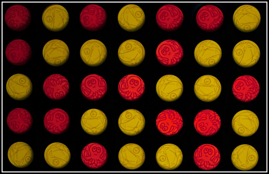
win colour by scilly puffin, on Flickr
- Messages
- 4,407
- Name
- Marsha
- Edit My Images
- Yes
Oh yes, I see what you mean!
OP
LauraJ23
Suspended / Banned
- Messages
- 14,759
- Name
- Laura
- Edit My Images
- No
Oh yes, I see what you mean!
Thanks Marsha.
The SC does work better here Michael, good choice on the PP
I had the same problem but chose to crop mine instead.
Its maybe a tad dark in the top left corner but thats being picky. Iain
Hi Iain, thanks for your comment. The darkness was from a bit of uneven light painting.
Good work Michael, fits the theme nicely (although it took me a little while to work out what I was looking at, and what SC meant)
Hi John, sorry about the sc bit, I automatically abbreviate selective colouring. Thanks for popping by
OP
LauraJ23
Suspended / Banned
- Messages
- 14,759
- Name
- Laura
- Edit My Images
- No
Here are some pics for the shiny theme. We brought a new toaster on Saturday which was nice and shiny! It is a very difficult object to photograph. Exposure was very tricky, so gone with 2 versions, a black and white one and a colour version. At least there are still some shiny bits showing. Could be a good candidate for light painting.

Week 11, Shiny by scilly puffin, on Flickr
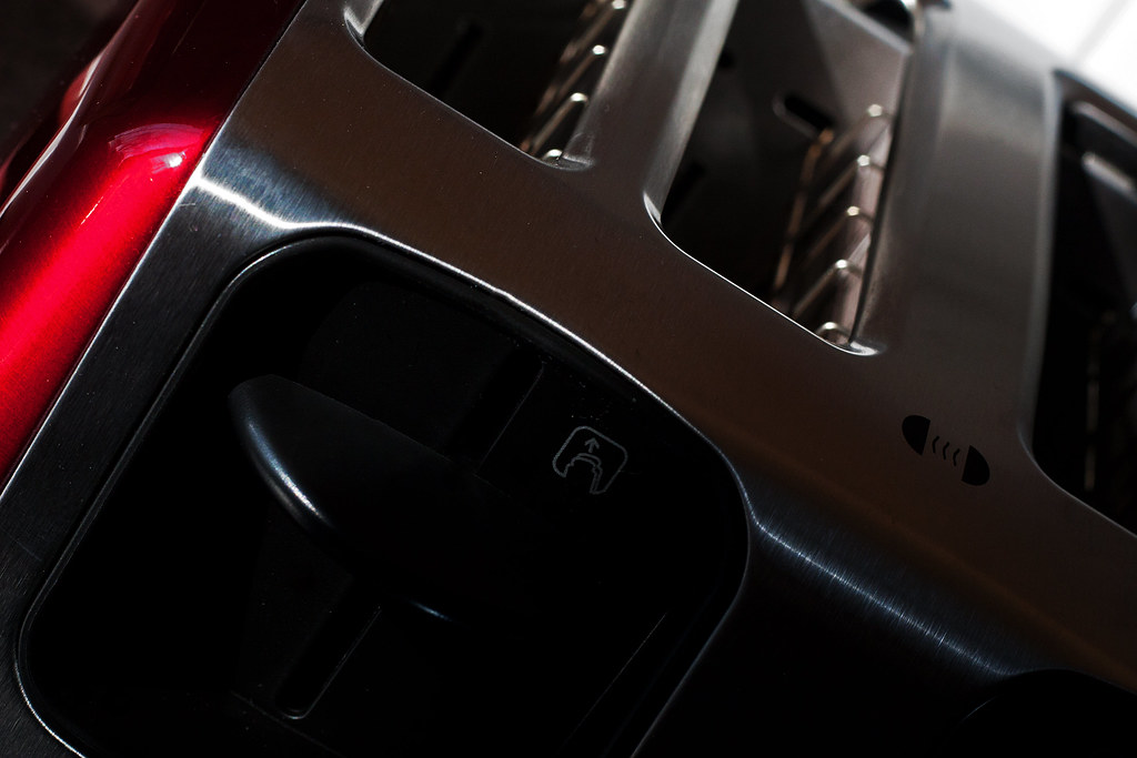
Week 11, Shiny #2 by scilly puffin, on Flickr
Whilst in the kitchen I saw my fairy liquid bottle. With shiny in mind I decided to take some pics as well. If I get chance I might do a full bottle view, but quite liked this crop.
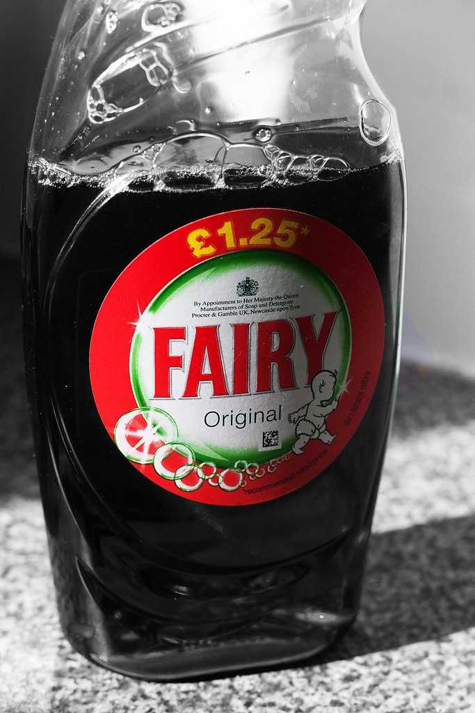
Week 11, Shiny #3 by scilly puffin, on Flickr
Week 11, Shiny by scilly puffin, on Flickr
Week 11, Shiny #2 by scilly puffin, on Flickr
Whilst in the kitchen I saw my fairy liquid bottle. With shiny in mind I decided to take some pics as well. If I get chance I might do a full bottle view, but quite liked this crop.
Week 11, Shiny #3 by scilly puffin, on Flickr
Marshall194
Suspended / Banned
- Messages
- 234
- Name
- Chris
- Edit My Images
- No
I think it's number two for me the red just gives the image a twist!
- Messages
- 4,407
- Name
- Marsha
- Edit My Images
- Yes
I splash of red on number two really works. I like the angle you have shot this at.
I think the fairy bottle is quite a clever idea, lots of bubbles and starbursts in this theme, you've got them all in the label
I think the fairy bottle is quite a clever idea, lots of bubbles and starbursts in this theme, you've got them all in the label
Southdowns
Suspended / Banned
- Messages
- 2,820
- Name
- Mark
- Edit My Images
- Yes
Yes, deffinately number 2. The red really makes it, and the B&W version just dulls it a touch too much for this theme I think. Great shot