
blondie606
Suspended / Banned
- Messages
- 8,398
- Name
- Lynne
- Edit My Images
- Yes
Hi Liam
What a great shot for Clutter & another different take on the theme
Delicate : Macro is addictive ! Love the color & that you can see bits of pollen on the 1st shot, well done")
Love the clarity of color in the white flower ,looks like you can reach in & touch the petals .Not sure about the front petals being oof , maybe just me but would have prefered all the petals in focus .Still miles ahead of what I could have done though ,great work
What a great shot for Clutter & another different take on the theme
Delicate : Macro is addictive ! Love the color & that you can see bits of pollen on the 1st shot, well done
Love the clarity of color in the white flower ,looks like you can reach in & touch the petals .Not sure about the front petals being oof , maybe just me but would have prefered all the petals in focus .Still miles ahead of what I could have done though ,great work
 Your macros are lovely. I really like the colours and crop of #1 - it's my favourite of the two!


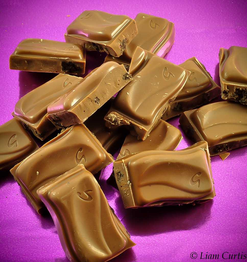
 Both the jaffa cakes & the chocolate jump out at you ,great colors & focus , looks as though you can reach out & pick them up to eat ,really excellent shots
") Jaffa cakes look good enough to eat but the chocolate looks a little off in tone...but I think I get plain chocolate ones...
Jaffa cakes look good enough to eat but the chocolate looks a little off in tone...but I think I get plain chocolate ones...

