Karma's 52. Updated with all!

So a little about me I suppose. As you know at this stage I'm fairly new to this photography lark and really enjoying it. I'm at that phase where I feel I have enough knowledge about my camera to really expirement, but on the downside, the minute I see something I want to try it. So I'm taking so many different types of photographs I really haven't settled into a style just yet! At least I don't think so.

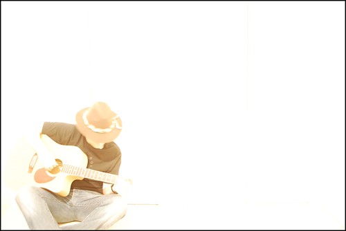
Who am I? I'm originally Irish, from the west coast where we get the dump of crap weather so since moving to London I really don't know what you guys have to complain about :D. At the moment, apart from photography, my main passion is music. So I thought this week I'd incorporate that.


So, where last weeks theme my photo was definitely more on the dark side... this week I decided to turn the tables and purposely do the exact opposite :) overexposure!

 
Last edited:
The only self critique I have this time is I need to work on borders. This one could do with a border unless you view it on black or something. But I don't quite know what border would have suited this.

Anyway! Looking forward to your thoughts on this one.
 
Ooh brave and experimental this one :) I would love to have see the image include his feet rather than crop at the shins - I really am in about 3 minds on this one....I'm gonna have to come back to it a few times I think - the composition I like (apart from the aforementioned feet :)) and I applaud you going for it - maybe, for my tastes its a tad too overexposed....

Hmmm - goes away and thinks a bit :)

Thanks Dark. Looking back I actually think there's a couple of things wrong with it. Firstly I'm tending to agree with the slight overexposure. I might try this again with a little more of me (yes that's me in the pic!), and at a slightly shorter exposure. But also... and this is something I keep forgetting to do.... WHITE BALANCE!! The room I shoot that in isn't great with light, so I use a lot of artificial light... and end up with yellow photos... :bonk:

I'm gonna report back when I get a bit of time to reshoot this.
 
I rather like it. The border you have chosen edges it in nicely. I feel there's a little too much white space on the right. I can't decide if you need a little more punch, but then is that the point of this kind of shot... I do tend to go for more contrasty images though.
 
Another idea I never thought of, its a great ideas you cant fault it before it was planned like that :lol:
 
Very clever idea, love the composition and the subject.

I'm going to agree with Dark Star and say it is just a touch too far with the overexposure, maybe pulling the middle of the guitarist back and letting the edges go nuclear might work.

Still a really good creative shot, well done.
 
Excellent effort on your part and so close for me to be a good shot, yes shame about the feet missing but in the end it was a under exposed shot to far really. You need to pull back a tad more detail, but I still think it a brilliant effort and well done on pushing yourself with this shot...:clap::clap::clap:
 
album cover like

That was my exact thought when I first saw this.
I really could see it as an album cover.

If I'm being picky, then as was already said, I'd like to see you a bit higher up in the photo (with feet) and a touch to the right so that you were on a third - but it still works well as it is for me.
It can't have been an easy shot to get, it's not something I'd even be brave enough to try so a big well done on this one :)

It was good to read a bit about your other hobbies - so I suppose that works for the exposed theme too!
 
I like the way this has come out my only complaint is you have cut off your feet :)

Thanks! Yeah, the damn feet! Why do I only spot these things after uploading my pictures :D

Very clever idea, love the composition and the subject.

I'm going to agree with Dark Star and say it is just a touch too far with the overexposure, maybe pulling the middle of the guitarist back and letting the edges go nuclear might work.

Still a really good creative shot, well done.

Thanks Hyster! A touch darker might have been better. Although I did go back to this and try it, but I couldn't really get a balance between over and under exposure to suit the shot. And there's only so many times you can sit down for 20/30 seconds before you decide enough is enough!

Another idea I never thought of, its a great ideas you cant fault it before it was planned like that :lol:

Thanks Andy!

I rather like it. The border you have chosen edges it in nicely. I feel there's a little too much white space on the right. I can't decide if you need a little more punch, but then is that the point of this kind of shot... I do tend to go for more contrasty images though.

Thanks jg! The whitespace on the right was intended. I did mean to leave a small bit of detail from the background, but as mentioned I kind of over exposed it. So I can see where you're coming from.
 
Excellent effort on your part and so close for me to be a good shot, yes shame about the feet missing but in the end it was a under exposed shot to far really. You need to pull back a tad more detail, but I still think it a brilliant effort and well done on pushing yourself with this shot...:clap::clap::clap:

Thanks Spartacus! Very much appreciated.

LOVE IT
album cover like

I'm thrilled someone mentioned this! That was the effect I was trying to achieve, but I didn't really want to say :$. Not that I'll ever release an album, I wish I was that good! But it did inspire the shot.

That was my exact thought when I first saw this.
I really could see it as an album cover.

If I'm being picky, then as was already said, I'd like to see you a bit higher up in the photo (with feet) and a touch to the right so that you were on a third - but it still works well as it is for me.
It can't have been an easy shot to get, it's not something I'd even be brave enough to try so a big well done on this one :)

It was good to read a bit about your other hobbies - so I suppose that works for the exposed theme too!

Again, I'm delighted someone thought of this! I really should go back and get my feet in the shot. Maybe after I've contended with mono I'll have another go :D
 
You've already identified the couple of little niggles with this shot and it is so close to being perfect as an album cover.

And, for being new to photography you've pulled off something I wouldn't have attempted so a big :thumbs: from me.

And nice to get to know you a bit better too :D
 
Thanks again everyone! And thanks Jill for those nice words.

Ok, so I have some good news. But I'm going to prolong it with a big story :lol:

So, here I am, about 3 months at this photography and not really doing anything with it. I'm kinda happy to keep this as a hobbie to be honest. It sounds like quite a hard skill to make a good career out of unless you are really talented, so I think that will spoil the fun I'm having just being an amature! One of the most fun things I did was sit alongside several other pros while photographing the Tamil protest here in London. Those guys were leagues ahead of me, but I still managed to sneak in a nice shot or too. And they were all very accommodating. They knew I wasn't going to tread on their territory seeing my gear and my sheepish look :D. All a great bunch of guys. And I was in contact with one of the lead protestors before hand and told him I was amature, but he still was happy enough with me to be there. In return I told him he was free to use any photos of mine if he saw fit... Then a week ago I find out that 1 of my photos was published on a website and magazine from that protest! :D Shock and horror! Couldn't believe it, but delighted with myself!

Anyway, on to mono. I wasn't really sure what I would do here, I have tinkered with B&W/Sepia before, but never really got a good picture to work with. Before I present the photograph I did promise one thing.... I WOULD return to crack these black background photographs! I'm getting closer! Here's the Mono result (I suppose it's a slight cheat with the black background!):


This is the original:


Ok, so onto the self critique... well, the bits that I can see

1. I could do without the vase on the right... that slipped by me taking the shot.
2. The focus is ever so slightly off. Managed to focus on a staman in front of the flower I was meant to focus on.
3. The highest leaf has crept over the DOF and is annoying me. Not sure what I could have done about this though.

Apart from that I'm happy enough. I think I'm getting closer to mastering these shots now! May I thank all of you for your feedback on the mushroom shot, especially to those who offered tips on how to improve these style of photos!

I'm not sure which shot I prefer... the original or mono... But looking forward to your feedback once again. And as always, don't be afraid to be honest. I have a good thick skin ;)
 
Last edited:
ermm not seeing the mono picture? just the original here, which looks good apart from the vase!
 
s'there now...possibly a problem my end, the internet has been a bit hit and miss tonight.

The vase needs to go, far too distracting, but other than that I like it.:thumbs:
 
Nice shot, I have to say, I personally prefer the colour for this shot. But it's good...And agree, vase needs to go :) :thumbs:
 
First off, congratulations on getting your photo published :clap:
I'm about 3 months in too, and I don't have anything anywhere near good enough to publish!

I'd love to see your second attempt at exposed. I think that's got great potential and I genuinely do think it would make a fab album cover.
And never say never . . . you just don't know whether you might get to record something one day.

Now Mono :

I agree about the vase - although it's not so much of a distraction in the mono version.
Personally, I actually prefer the mono to the colour for this one - it gives more of a feel of the flower wilting and dying.
I'd like to see a touch more contrast though - some deeper shadows to bring out the texture of the flower and leaves.

All in all I really like your take on this and you've done what you set out to do with the black background thing.
 
Last edited:
Lovely shot. I like the mono and colour equally myself. You are really captured a gorgeous shade of green in the colour version.

Cant say much more than has already been said though other than it looks like the flower is suspended mid air (perhaps different lighting would bring out the trunk of the flower (if that is what you call it).

PS congrats on getting your photo published!
 
A lot to catch up on here, KG - you've been busy while my back was turned. :)

Exposed: I've read everybody else's comments with interest and agree with the album cover comments - great! I would love to see it in b&w, though. I think the over-exposure would work really well.

I don't think it matters that you've cut off your feet because the strength is in the composition and the over-exposure rather than the detail. Very creative. :)

Mono: Yes, the vase has to go - but that mono version is stunning. It reminds me of the illustrations in a set of very old flower books we've got - very impressive. :thumbs:

The focusing issues you've mentioned are more apparent in the colour version - but it's still a strong image.

Oh - and thanks for the introduction - it's nice to know you. :)

Jean
 
Very adventurous on exposed, but I think it has worked. Have to agree with the others on mono....that vase has to go ;)
jon
 
I like the tones you have used but i find the vase at the edge of the shot a little distracting, nice idea though :D
 
I prefer the Mono, but it's needs something to bring it out more. It's a good shot but could be better, just looks a bit flat and clone out that vase. I don't think it adds anything, well for me anyway...:thinking:
 
I like the sepia toning, and the how picture gives off a slightly disturbing air.
I agree you could have lost the vase, and it's a smidge dark for me.
However, it's a great picture overall and one I'd be happy with! :)
 
Great idea KG (I'm not going to mention the vase :exit:) and it is a little dark on my screen, but like JG says, looks like an old fashioned flower plate, so with just a bit of tweaking this would be stunning :thumbs:
 
The three points you've made on mono are the three I'd make too :)

Great attempt and almost there :) The colours in the original are lovely btw :)
 
I like the Mono shot, a simple bit of potatoshop and you have a really nice image.

Good shot.
 
s'there now...possibly a problem my end, the internet has been a bit hit and miss tonight.

The vase needs to go, far too distracting, but other than that I like it.:thumbs:

Thanks! Vase does need to go.

Nice shot, I have to say, I personally prefer the colour for this shot. But it's good...And agree, vase needs to go :) :thumbs:

Thanks! I think I prefer the colour too. But the mono needs a bit more gimp lovin to make it work a bit better (Gimp is more financially viable for me and sounds kinky in sentences!)

First off, congratulations on getting your photo published :clap:
I'm about 3 months in too, and I don't have anything anywhere near good enough to publish!

I'd love to see your second attempt at exposed. I think that's got great potential and I genuinely do think it would make a fab album cover.
And never say never . . . you just don't know whether you might get to record something one day.

Now Mono :

I agree about the vase - although it's not so much of a distraction in the mono version.
Personally, I actually prefer the mono to the colour for this one - it gives more of a feel of the flower wilting and dying.
I'd like to see a touch more contrast though - some deeper shadows to bring out the texture of the flower and leaves.

All in all I really like your take on this and you've done what you set out to do with the black background thing.

Thanks Sarah! Again, yeah, the Vase needs to go. The mono version does need a bit of work so I might have another tinker with it in Le Gimp.
 
Lovely shot. I like the mono and colour equally myself. You are really captured a gorgeous shade of green in the colour version.

Cant say much more than has already been said though other than it looks like the flower is suspended mid air (perhaps different lighting would bring out the trunk of the flower (if that is what you call it).

PS congrats on getting your photo published!

Thanks! Good point on the Trunk. Never spotted :D

A lot to catch up on here, KG - you've been busy while my back was turned. :)

Exposed: I've read everybody else's comments with interest and agree with the album cover comments - great! I would love to see it in b&w, though. I think the over-exposure would work really well.

I don't think it matters that you've cut off your feet because the strength is in the composition and the over-exposure rather than the detail. Very creative. :)

Mono: Yes, the vase has to go - but that mono version is stunning. It reminds me of the illustrations in a set of very old flower books we've got - very impressive. :thumbs:

The focusing issues you've mentioned are more apparent in the colour version - but it's still a strong image.

Oh - and thanks for the introduction - it's nice to know you. :)

Jean

Thanks Jean! I am going to return to the "Album Cover" shot too. Maybe this weekend. We'll see :)

Very adventurous on exposed, but I think it has worked. Have to agree with the others on mono....that vase has to go ;)
jon

Thanks jon!

I like the tones you have used but i find the vase at the edge of the shot a little distracting, nice idea though :D

Thanks! Yeah, vase needs to go!
 
I prefer the Mono, but it's needs something to bring it out more. It's a good shot but could be better, just looks a bit flat and clone out that vase. I don't think it adds anything, well for me anyway...:thinking:

Thanks! Yeah, I didn't spot the Vase until after I had taken it and uploaded it. I should go back and clone it out! Needs a bit of work yet.

I like the sepia toning, and the how picture gives off a slightly disturbing air.
I agree you could have lost the vase, and it's a smidge dark for me.
However, it's a great picture overall and one I'd be happy with! :)

Thanks steve!

Great idea KG (I'm not going to mention the vase :exit:) and it is a little dark on my screen, but like JG says, looks like an old fashioned flower plate, so with just a bit of tweaking this would be stunning :thumbs:

Thanks! Yeah, that damn vase eh!

The three points you've made on mono are the three I'd make too :)

Great attempt and almost there :) The colours in the original are lovely btw :)

Thanks! It was good to go back to the black background shot.

I like the Mono shot, a simple bit of potatoshop and you have a really nice image.

Good shot.

Cheers! Aye, unleash the Gimp on it in my case.


All the feedback has been excellent, I'm learning bucket loads so thanks y'all! I'm buggered this week. Can't think of anything :thinking: Hopefully I'll spot something over the weekend though
 
Last edited:
More great news, I'm off to Greece tomorrow for a week! So my photo next week will be drastically late. I'll probably upload 2 in 1 to catchup.

On to season, so I finally came up with an idea this week. I was walking through the park and spotted a lot of leaves on the ground when it occurred to me... duh, autumn leaves...


What did I learn:

1. Taking a picture of a falling leaf didn't work for me! As patient as my OH was there's only so many times she will drop a leaf before getting extremely bored
2. To get a proper photo of a leaf on the ground you gotta get your own ass (and head) down to ground level :D
3. Changing some white balance settings can really help bring out certain colours.
4. Do retake shots. My first was AWFUL! Really over exposed and just pretty pathetic!
5. I stuggle deciding on a border. I went through about 8 styles before settling on this one.

Looking forward to more feedback!
 
Oooooh I like that!

Great dof and lovely crisp, clean shot of the leaf. Definitely worth sprawling on the floor for :lol:

Have a great time in Greece and I look forward to seeing your catch-up shots.

p.s. I sympathise with your OH. We went through the same last week, with me getting him to blow dandelion seeds :D
 
Your (and your OH's) perseverence paid off with this - it's a gorgeous shot. The colours, dof, composition are spot on. :clap::clap:

I'm a bit unsure about the border - for me it's a bit overpowering, but it's just personal choice and it doesn't detract from the picture.

Have a great holiday and I hope the theme for next week is do-able in Greece. :D

Jean
 
Lovely shot and well spotted...focus is nice and crisp along with colours and lighting...can't fault anything its great, just the boarder lets it down. To me it's a light and airy shot with a much too heavy border... Still a cracking shot though...
 
Lovely shot and well spotted...focus is nice and crisp along with colours and lighting...can't fault anything its great, just the boarder lets it down. To me it's a light and airy shot with a much too heavy border... Still a cracking shot though...


Agree with Marcus other than...I like the border :)

Nicely seen and taken :D
 
Really like Mono, but that Vase is too obvious (I think the colour shot actually is nicer, but it's still good). Season, excellent, and sometimes laying on the ground is the only way :D...
 
Back
Top