
Mozziephotography
Suspended / Banned
- Messages
- 1,850
- Name
- Stephen
- Edit My Images
- Yes
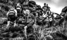
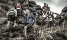
I have a number of fell races coming up in the next couple of months. I've been trying to create a style (preset) of my own which reflects the mud, grit and determination of the runners in the harsh landscape that they run in. Usually desaturate the colours and have used "Midnight" from Color Efex as well. It can be a bit too much at times. t does become messy when figures and sky meet. If you don't like the image, that's fair enough. Help and advice would be great.

.jpg")
 Pickering 2019 - Nostalgia Overdrive


![1-Tigger Tor 2019-175-Edit[1].jpg](https://www.talkphotography.org/data/attachments/251/251170-8ab398e9b289b03fd68462c80a7d0db6.jpg?hash=irOY6bKJsD "1-Tigger Tor 2019-175-Edit[1].jpg")
")

