garyplumbridge
Suspended / Banned
- Messages
- 52
- Name
- Gary
- Edit My Images
- Yes
Hi everyone,
Photo52 is such a fantastic idea, I hope I can keep up the motivation for a year.
Here's my first entry on a theme of Accommodation:
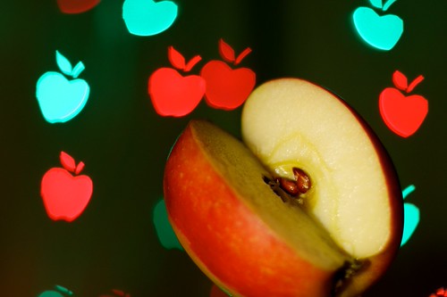
Bumf:
It's about the accommodation that apple seeds receive, and how from an apple-seed's perspective the whole universe is just apple so this photo contains nothing but apples too.
I'd never tried to manipulate the bokeh in this way before and I'm very pleased with the result but I'm not entirely sure if the theme came through strong enough. Additionally, the green-white of the brightly lit apple is a bit overpowering.
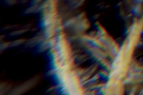
Here's some pictures of how this was taken/
Obviously, C&C are welcome and appreciated!
Photo52 is such a fantastic idea, I hope I can keep up the motivation for a year.
Here's my first entry on a theme of Accommodation:
Bumf:
It's about the accommodation that apple seeds receive, and how from an apple-seed's perspective the whole universe is just apple so this photo contains nothing but apples too.
I'd never tried to manipulate the bokeh in this way before and I'm very pleased with the result but I'm not entirely sure if the theme came through strong enough. Additionally, the green-white of the brightly lit apple is a bit overpowering.
Here's some pictures of how this was taken/
Obviously, C&C are welcome and appreciated!
Last edited:

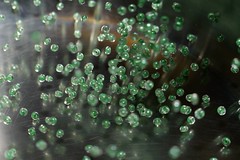
 the shots are really good
 ") like the background on the first well done ...oh and welcome to TP
like the background on the first well done ...oh and welcome to TP 
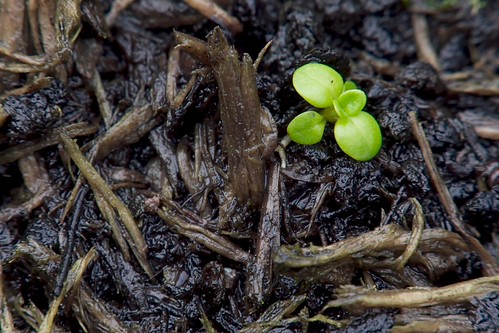
") & I love the though it's a tropical plant ...lol
& I love the though it's a tropical plant ...lol .
.


 (losing about 3 stops of dynamic range at iso160)