philthejuggler
Suspended / Banned
- Messages
- 7,086
- Name
- Phil
- Edit My Images
- Yes
I quite like both of these still-lifes, but I think the subject needs to be off centre.


") ) I love the images. At first I thought the first one had more impact - but now, well, not so sure, they're both strong. I love the cropped version best (but would drink either!
) I love the images. At first I thought the first one had more impact - but now, well, not so sure, they're both strong. I love the cropped version best (but would drink either! ") ) - a good strong image with an interesting but not intrusive background. Ahhhh!! Brilliant take on the theme, imho.
) - a good strong image with an interesting but not intrusive background. Ahhhh!! Brilliant take on the theme, imho. Saw these on Flickr...so I waited.
#1 for me. The placement really emphasises the shape and crisp white BG is great.
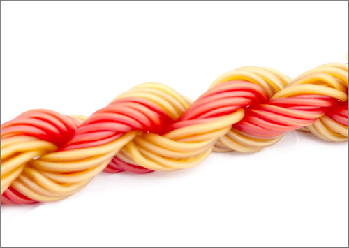
It looks a tad bright to me...I bumped up the red and yellow in LR and it seemed to remove the greyness.
Overall, #1 is a cracker....
No: 1 for me too, i really like the loose ends, nice composition and good lighting - Nice One
really pleased with how it all turned out. What I saw in my head actually came true!! Hi Alex - finally got round to commenting on your thread.
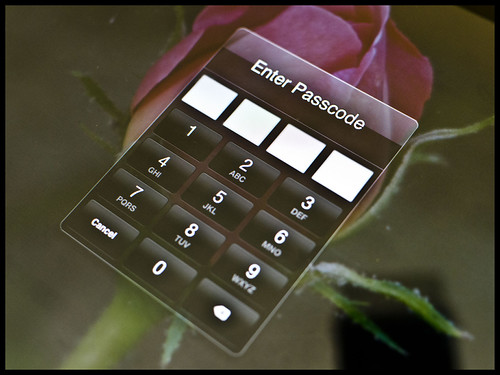
Directions: The second one for me! It works nicely - good depth of field - and is spot on for the theme.
Fear: How can you have so much fun creating Fear?? (only joking!
Sigh: Cuba's my favourite place, so this raised a sigh immediately.
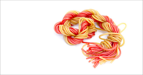
Sweet: I was a bit confused by this at first. It didn't immediately say 'Sweet' to me, but I just don't like sweets and didn't recognise it. Sorry. Both shots are excellent with really good backgrounds. On balance, I'd go for the first one for the composition.
Jean
I like this. I like those sweets too.
the sweets are very nice, Ikea strawberry and caramel laces yum yumlizzy23 said:Alex i genuinely thought i'd commented on your thread, apologies i haven't been here before!
Direction, love the idea, prefer the edit with the tighter crop.
Fear - Brilliant a lot of thought went in to that
Sigh - yep can relate to that i prefer the tighter crop as well,
Sweet - simple and clean, but would agree with Andy that the colours need a boost
Cuba is just fabulous, I am a Havana Club convert ever since going and I would really like to go back again soon.

Thanks all for the comments and stopping by! Really pleased with this one
Great feeling, isn't it