
- Messages
- 11,730
- Name
- Chris
- Edit My Images
- Yes
Gosh Anita, you did a mega catch-up, and now so must I!
Pattern: I didn't like this at first, but it's much better in the larger version on Flickr. Good crop and I particularly like the watering can that breaks the pattern!
Movement: tricky... some thought the windmill thingy was out of focus, but I reckon it's spot on (looking at the hub of the wheel), so the blurring is down to the movement. That said, the blurriness does look odd in a pic with lots of sharp bits in it. But there are lots of other interesting elements to compensate!
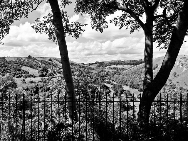
Below: crisp and sharp, lovely organic form, nice light, well composed. The only crit for me is that it might be better with a bit more interest in the sky...
Size: nice idea, but somehow the shot isn't particularly ineresting. Maybe it needs some other compositional element, or some sort of "story" to tie it together more?
Greed: +1!
Kind: like this, doesn't look wonky to me! Excellent composition.
Process: nice colours and control of focus, but again there doesn't quite seem to be enough in the shot, and those truncated carrots at the bottom look a bit sad to me. Sorry, that feels just too negative...
Rock: oh yes, lovely colours and lighting, sexy glistening, great compositonal arrangement, I very much like that!
Pattern: I didn't like this at first, but it's much better in the larger version on Flickr. Good crop and I particularly like the watering can that breaks the pattern!
Movement: tricky... some thought the windmill thingy was out of focus, but I reckon it's spot on (looking at the hub of the wheel), so the blurring is down to the movement. That said, the blurriness does look odd in a pic with lots of sharp bits in it. But there are lots of other interesting elements to compensate!
Below: crisp and sharp, lovely organic form, nice light, well composed. The only crit for me is that it might be better with a bit more interest in the sky...
Size: nice idea, but somehow the shot isn't particularly ineresting. Maybe it needs some other compositional element, or some sort of "story" to tie it together more?
Greed: +1!
Kind: like this, doesn't look wonky to me! Excellent composition.
Process: nice colours and control of focus, but again there doesn't quite seem to be enough in the shot, and those truncated carrots at the bottom look a bit sad to me. Sorry, that feels just too negative...
Rock: oh yes, lovely colours and lighting, sexy glistening, great compositonal arrangement, I very much like that!


 can't put my finger on why? perhaps the front light could have been a bit brighter or less bright iyswim? did you fill flash? It's nicely all in focus and I like the palette, good effort.
") good dof and subject.
good dof and subject.


 Like it.
 )
)

