Richard Miller
Suspended / Banned
- Messages
- 329
- Name
- Richard Miller
- Edit My Images
- Yes


")
Glad to see you made it Richard
Nice image, Fits the theme nicely, well after you have eaten it of course lol .
Just one comment you linked it back to the home page, and not your thread.
( but I've sorted that for you)
I thought it was being served on a dinner sized plateA wafer thin mint......??

That wouldn't have been around long enough here for a photo to have been taken.
Only slight crit is I would have kept the shadow at the bottom in the crop.
") hope you enjoy these last few weeks.
hope you enjoy these last few weeks.Hi Richard ...good to see a new face here
Super shot for Seasonal ...lovely autumn light and composition.
Full, yum yum ...that looks good ...my eyes always wander to the deserts menu even before I choose my main meal ...perfect choice for the theme.
Thanks for the comments! Pudds areca firm favourite in this house too! that particular one was cooked in a mug in the microwave!! Strange but true!!


Hi Richard & welcome. Good start to the 52s.
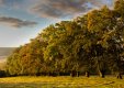
Seasonal ... top marks, love that low light on the trees from top to bottom. Excellent POV, dramatic sky.
Thanks!
Habit ... another interesting take. A bit dark, but as you've added vignette, I guess that's the whole point ... "just waiting for the unwary".
NNniiicceeee bun
Looks OOF on my mac, but a nice, yummy interpretation.
Cheers.

That's interesting Richard. Any chance you can explain how to use the Unsharp mask option?I have relooked at the cake - using an unsharpe mask to see if I can sharpen it up a tad...... it looks sharp as a pin in the PSD file ? I cant retake it as I scoffed the lot!!
As Richard's not been around for a couple of days, Its just a sharpening tool, with sliders, in photo shop, nothing mystical. Its just more controllable (IMO) than other sharpening tools.That's interesting Richard. Any chance you can explain how to use the Unsharp mask option?

I always try to avoid too many objects in my picture so that it won't be too busy, would love some advice on that. But you managed to pull this one off
Thank you and @Cobra for the feedback re the Unsharp mask - will have to give it a try.
I really like that - an excellent submission Richard - well lit and sharp in every detail .... a further plus factor for me is that it's in b&w. (Is that a replica notice top right from May 1901 - bet it's not PC eh!).
Hi Blush - thanks for the comments - much appreciated! I often find that using B&W in a "complicated" image can reduce the business of the image and give more structure and order. I guess "Covered" was always going to be a busy image!!
Welcome to the group! I am new here too.....

Hi Richard.
I'm going to have to agree with Nora, I find 'Covered' just a little too busy. B&W was the right choice for it imo, and it was always going to be a busy shot.
I wonder is adding a border to it would give it a less busy counterpoint. Dunno ( I may be talking bobbins).
Hi Richard
. but I'd like to see it in muted colour and without the light reflection.