

mata.morrison
Suspended / Banned
- Messages
- 1,033
- Name
- Matthew
- Edit My Images
- Yes
Well just got my second order from DSCL last night, I'm pretty disappointed to say the least...
Since my first order (which I also wasn't 100% with) I got a new monitor and got it calibrated with a Spyder 3 Pro. I got my prints and they are really dark compared to on screen, I used the correct colour profile as well. They are worse than using my old uncalibrated monitor.
What went wrong? Any ideas?
Last edited:

") )
)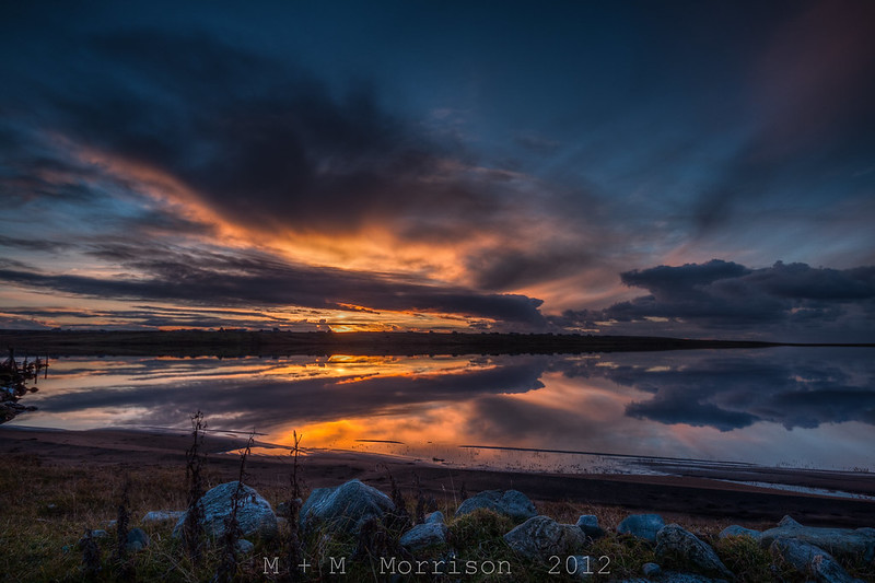

") I just have to sort my monitor to print settings. Going to have to re-order that print tonight and take a bit of a gamble and bump the exposure and rocks up slightly as it's for a Christmas prezzie from someone else.
I just have to sort my monitor to print settings. Going to have to re-order that print tonight and take a bit of a gamble and bump the exposure and rocks up slightly as it's for a Christmas prezzie from someone else.