
and help to keep the site free for all
You are using an out of date browser. It may not display this or other websites correctly.
You should upgrade or use an alternative browser.
You should upgrade or use an alternative browser.
Is anything distracting?
- Thread starter Ted 2
- Start date
dibbly dobbler
Suspended / Banned
- Messages
- 3,158
- Name
- Mike
- Edit My Images
- Yes
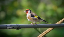
same heresticky label and the 'cane' bottom rh side its too bright and pulls you down that way and clashes with the overall colour scheme of the shot distracting from the bird - for me anyway")
skullfunkerry
Suspended / Banned
- Messages
- 1,814
- Name
- Kerry
- Edit My Images
- Yes
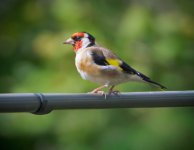
I agree with the comments above, much prefer this version. Personally, I think I'd crop a little tighter to get rid of some of the space under the pipe, too.Thanks all
Bristolian
Suspended / Banned
- Messages
- 4,428
- Name
- Steve
- Edit My Images
- Yes
In addition to the comments above, I was going to say that I find the bramble stem that appears to stop at the pipe a distraction as it's unlikely to be like that in reality. Nice to see you got rid in the second version ")